
Visualize Data from the Spectro-polarimeter for Planetary Exploration one (SPEXone)#
Authors: Sean Foley (NASA, MSU), Meng Gao (NASA, SSAI), Ian Carroll (NASA, UMBC)
The following notebooks are prerequisites for this tutorial.
Learn with OCI: Data Access
An Earthdata Login account is required to access data from the NASA Earthdata system, including NASA ocean color data.
Summary#
PACE has two Multi-Angle Polarimeters (MAPs): SPEXOne and HARP2. These sensors offer unique data, which is useful for its own scientific purposes and also complements the data from OCI. Working with data from the MAPs requires you to understand both multi-angle data and some basic concepts about polarization. This notebook will walk you through some basic understanding and visualizations of multi-angle polarimetry, so that you feel comfortable incorporating this data into your future projects.
Learning objectives#
At the end of this notebook you will know:
How to acquire data from SPEXone
How to plot geolocated imagery
Some basic concepts about polarization
How to make animations of multi-angle data
Contents#
1. Setup#
Begin by importing all of the packages used in this notebook. If your kernel uses an environment defined following the guidance on the tutorials page, then the imports will be successful.
import cartopy.crs as ccrs
import earthaccess
import matplotlib.pyplot as plt
import numpy as np
import xarray as xr
auth = earthaccess.login(persist=True)
2. Get Level-1C Data#
Download some HARP2 Level-1C data using the short_name value “PACE_SPEXONE_L1C_SCI” in earthaccess.search_data. Level-1C corresponds to geolocated imagery. This means the imagery coming from the satellite has been calibrated and assigned to locations on the Earth’s surface. Note that this might take a while, depending on the speed of your internet connection, and the progress bar will seem frozen because we’re only downloading one file.
auth = earthaccess.login(persist=True)

results = earthaccess.search_data(
    short_name="PACE_SPEXONE_L1C_SCI",
    temporal=("2024-05-20", "2024-05-20"),
    count=1,
)

paths = earthaccess.open(results)
If you see HTTPFileSystem in the output when you display paths, then earthaccess has determined that you do not have
direct access to the NASA Earthdata Cloud.
It may be wrong.
prod = xr.open_dataset(paths[0])
view = xr.open_dataset(paths[0], group="sensor_views_bands").squeeze()
geo = xr.open_dataset(paths[0], group="geolocation_data")
obs = xr.open_dataset(paths[0], group="observation_data").squeeze()
3. Understanding Multi-Angle Data#
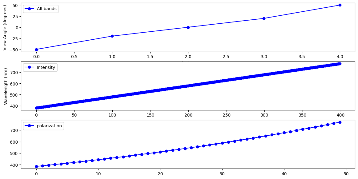
SPEXone is a hyper-spectral sensor with 400 intensity bands (380-779nm) and 50 polarization bands (within 385-770nm). SPEXone is also multi-angle measures five view angles for all its spectral bands. Therefore, there is no need to combine the spectral bands and angles together into one axis as what HARP2 data is organized.
Pull out the view angles and wavelengths.
angles = view["sensor_view_angle"]
wavelengths_i = view["intensity_wavelength"]
wavelengths_p = view["polarization_wavelength"]
Create a figure with 3 rows and 1 column and a reasonable size for many screens. The wavelengths for intensity and polarization are plotted in separated rows, where an arbitrary angle index is choosen.
fig, ax = plt.subplots(3, 1, figsize=(14, 7))
ax[0].set_ylabel("View Angle (degrees)")
ax[0].set_xlabel("Index")
ax[1].set_ylabel("Wavelength (nm)")
ax[1].set_xlabel("Index")

angle_index = 0
color, marker = 'blue', 'o'
ax[0].plot(
    #np.arange(start_idx, end_idx),
    angles,
    color=color,
    marker=marker,
    label='All bands'
)
ax[1].plot(
    #np.arange(start_idx, end_idx),
    wavelengths_i[angle_index, :],
    color=color,
    marker=marker,
    label='Intensity',
)
ax[2].plot(
    #np.arange(start_idx, end_idx),
    wavelengths_p[angle_index, :],
    color=color,
    marker=marker,
    label='polarization',
)
ax[0].legend()
ax[1].legend()
ax[2].legend()
plt.show()
4. Understanding Polarimetry#
Both HARP2 and SPEXone conduct polarized measurements. Polarization describes the geometric orientation of the oscillation of light waves. Randomly polarized light (like light coming directly from the sun) has an approximately equal amount of waves in every orientation. When light reflects of certain surfaces or scattered by small particles, it can become nonrandomly polarized.
Polarimetric data is typically represented using Stokes vectors. These have four components: I, Q, U, and V. Both HARP2 and SPEXone are only sensitive to linear polarization, and does not detect circular polarization. Since the V component corresponds to circular polarization, the data only includes the I, Q, and U elements of the Stokes vector.
Let’s make a plot of the I, Q, and U components of our Stokes vector, using the RGB channels, which will help our eyes make sense of the data. We’ll use the view that is closest to pointing straight down, which is called the “nadir” view in the code. Since SPEXone swath is relatively narrow (100km), the sensor zenith angle at the edges of the swath will be slightly higher. It’s only a true nadir view close to the center of the swath.
The I, Q, and U components of the Stokes vector are separate variables in the obs dataset.
stokes = obs[["i", "q", "u"]]

# Check the data dimension
stokes["i"].shape, stokes["q"].shape, stokes["u"].shape
((396, 29, 5, 400), (396, 29, 5, 50), (396, 29, 5, 50))
The first three dimensions are the pixels along track, pixels cross tracks, and the view angles. Note that the dimensions for the stokes vector I, and Q (U) are different. Therefore, for visulizations, we will separate I and other polarization related variables.
# Nadir index can be simply set as
nadir_idx = 2

# We then thoose three RGB bands similar to HARP2 at 665, 550, and 440nm
wavelengths_i_index = [60, 170, 285]
wavelengths_i[0,wavelengths_i_index].values

# Then, get the data at the nadir indices and RGB bands:
rgb_i = stokes[["i"]].isel(
    {
        "number_of_views": nadir_idx,
        'intensity_bands_per_view': wavelengths_i_index
    }
)

# Check data dimension again
rgb_i["i"].shape
(396, 29, 3)
A few adjustments make the image easier to visualize. First, normalize the data between 0 and 1. Second, bring out some of the darker colors.
def rgb_data_scale(rgb):
    rgb = (rgb- rgb.min()) / (rgb.max() - rgb.min())
    rgb = rgb ** (3 / 4)
    return rgb

rgb_i = rgb_data_scale(rgb_i)
Add latitude and longitude as auxilliary (i.e. non-index) coordinates to use in the map projection.
rgb_i = rgb_i.assign_coords(
    {
        "lat": geo["latitude"],
        "lon": geo["longitude"],
    }
)
The granule crosses the 180 degree longitude, so we set up the figure and subplots to use a Plate Carree projection shifted to center on a -170 longitude. The data has coordinates from the default (i.e. centered at 0 longitude) Plate Carree projection, so we give that CRS as a transform.
crs_proj = ccrs.PlateCarree(-170)
crs_data = ccrs.PlateCarree()
The figure will hav 1 row and 3 columns, for each of the I, Q, and U arrays, spanning a width suitable for many screens.
fig, ax = plt.subplots(1, 1, figsize=(16, 5), subplot_kw={"projection": crs_proj})
fig.suptitle(f'{prod.attrs["product_name"]} RGB')

ax.pcolormesh(rgb_i["i"]["lon"], rgb_i["i"]["lat"], rgb_i["i"], transform=crs_data)
ax.gridlines(draw_labels={"bottom": "x", "left": "y"}, linestyle="--")
ax.coastlines(color="grey")
ax.set_title("I");
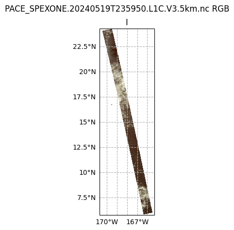
It’s pretty plain to see that the I plot makes sense to the eye: we can see clouds over the Pacific Ocean (this scene is south of the Cook Islands and east of Australia). This is because the I component of the Stokes vector corresponds to the total intensity. In other words, this is roughly what your eyes would see.
Next, let’s take a look at Q and U, as well as the degree of linear polarization (DoLP). Since the polarization dimension is different with the intensity spectral dimension, we select three polarization bands at similar spectral bands comparing with the intensities.
wavelengths_p_index = [9, 25, 39]
wavelengths_p[0,wavelengths_p_index].values

rgb_p = obs[["q", "u", "dolp"]].isel(
    {
        "number_of_views": nadir_idx,
        'polarization_bands_per_view': wavelengths_p_index
    }
)

rgb = xr.merge([rgb_i, rgb_p])
Create a figure with 1 row and 2 columns, having a good width for many screens, that will use the projection defined above. For the two columns, we iterate over just the I and DoLP arrays.
fig, ax = plt.subplots(1, 4, figsize=(16, 8), subplot_kw={"projection": crs_proj})
fig.suptitle(f'{prod.attrs["product_name"]} RGB')

for i, (key, value) in enumerate(rgb[["i", "q", "u", "dolp"]].items()):
    ax[i].pcolormesh(value["lon"], value["lat"], value, transform=ccrs.PlateCarree())
    ax[i].gridlines(draw_labels={"bottom": "x", "left": "y"}, linestyle="--")
    ax[i].coastlines(color="grey")
    ax[i].set_title(key.capitalize())
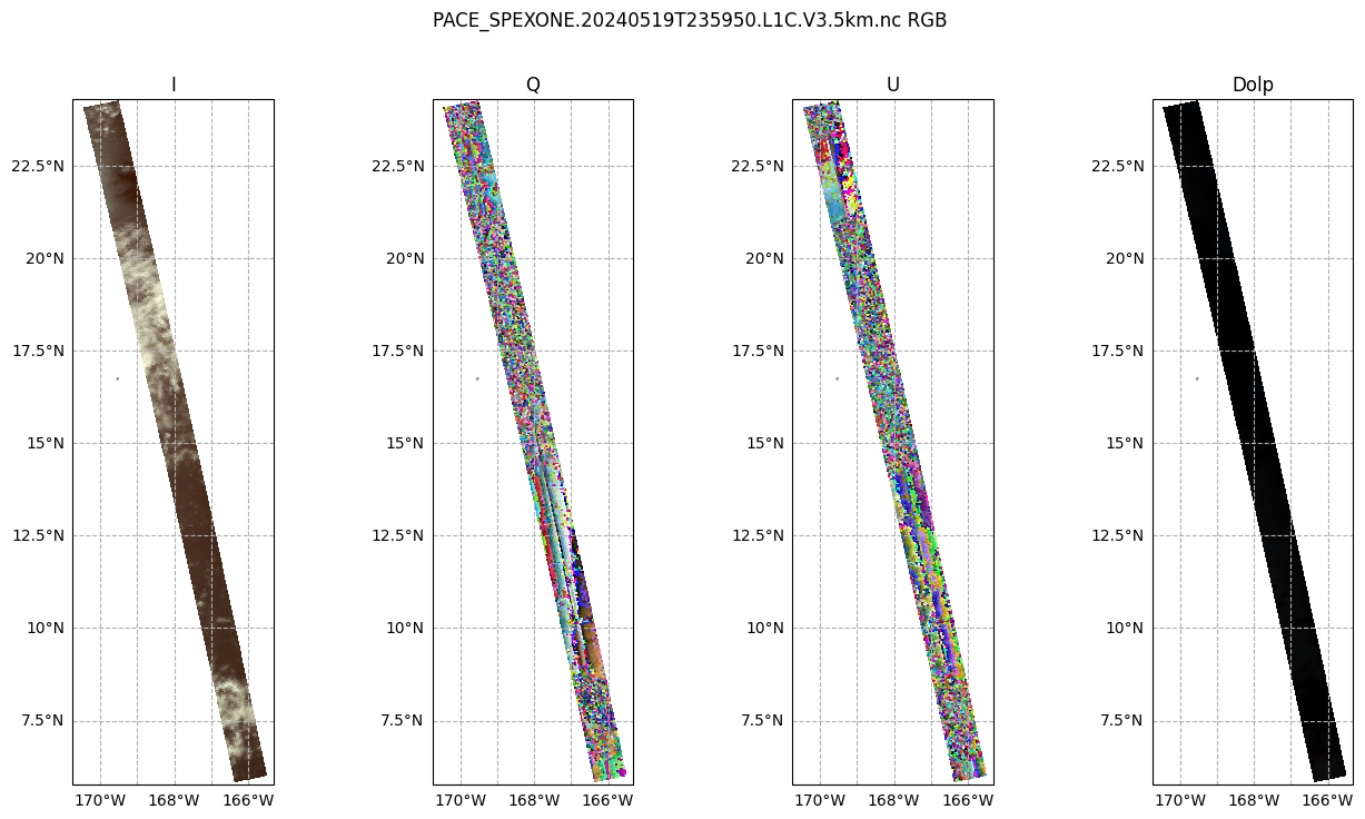
Different with the I component, the Q and U plots don’t quite make as much sense to the eye. We can see that there is some sort of transition in the middle, which is the satellite track. This transition occurs in both plots, but is stronger in Q. This gives us a hint: the type of linear polarization we see in the scene depends on the angle with which we view the scene.
This Wikipedia plot is very helpful for understanding what exactly the Q and U components of the Stokes vector mean. Q describes how much the light is oriented in -90°/90° vs. 0°/180°, while U describes how much light is oriented in -135°/45°; vs. -45°/135°.
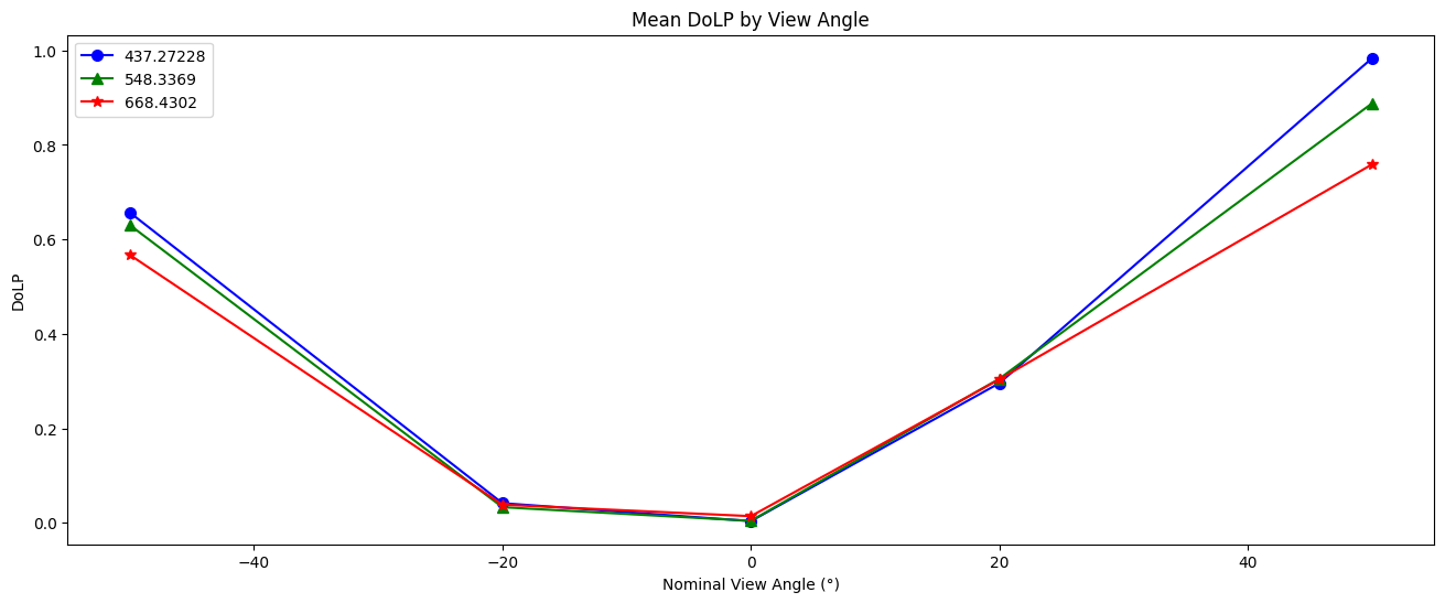
Let’s look at a line plot of DoLP:
dolp_mean = obs["dolp"].mean(["bins_along_track", "bins_across_track"])
dolp_mean = (dolp_mean - dolp_mean.min()) / (dolp_mean.max() - dolp_mean.min())
#select the same three bands as for the RGB plots, note that SPEXone do not have the same NIR bands at 870, therefore not included here
dolp_mean = dolp_mean [:, wavelengths_p_index]

fig, ax = plt.subplots(1,1, figsize=(16, 6))
wv_uq = np.unique(wavelengths_i.values)
plot_data = [("b", "o"), ("g", "^"), ("r", "*")]
for wv_idx in range(3):
    wv = wavelengths_p[0, wavelengths_p_index[wv_idx]].values
    c, m = plot_data[wv_idx]
    ax.plot(
        angles.values,
        dolp_mean[:, wv_idx],
        color=c,
        marker=m,
        markersize=7,
        label=str(wv),
    )
ax.legend()
ax.set_xlabel("Nominal View Angle (°)")
ax.set_ylabel("DoLP")
ax.set_title("Mean DoLP by View Angle")
plt.show()
5. Radiance to Reflectance#
We can convert radiance into reflectance. For a more in-depth explanation, see here. This conversion compensates for the differences in appearance due to the viewing angle and sun angle.
The radiances collected by SPEXone often need to be converted, using additional properties, to reflectances. Write the conversion as a function, because you may need to repeat it.
def rad_to_refl(rad, f0, sza, r):
    """Convert radiance to reflectance.
    Args:
        rad: Radiance.
        f0: Solar irradiance.
        sza: Solar zenith angle.
        r: Sun-Earth distance (in AU).

    Returns: Reflectance.
    """
    return (r**2) * np.pi * rad / np.cos(sza * np.pi / 180) /f0
The difference in appearance (after matplotlib automatically normalizes the data) is negligible, but the difference in the physical meaning of the array values is quite important.
refl = rad_to_refl(
    rad=obs["i"],
    f0=view["intensity_f0"],
    sza=geo["solar_zenith_angle"],
    r=float(prod.attrs["sun_earth_distance"]),
)
fig, ax = plt.subplots(1, 2, figsize=(4, 8))
red_idx = wavelengths_i_index[2]
ax[0].imshow(obs["i"].sel({"number_of_views": nadir_idx,'intensity_bands_per_view': red_idx}), cmap="gray")
ax[0].set_title("Radiance")
ax[1].imshow(refl.sel({"number_of_views": nadir_idx,'intensity_bands_per_view': red_idx}), cmap="gray")
ax[1].set_title("Reflectance")
plt.show()
print(f"Mean radiance    {obs['i'].mean():.1f}")
print(f"Mean reflectance {refl.mean():.3f}")
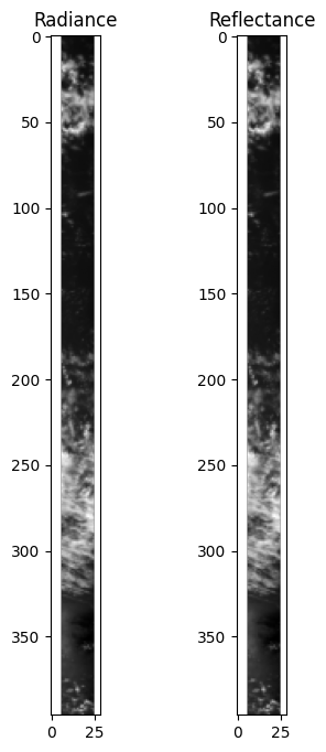
Mean radiance    126.4
Mean reflectance 0.252
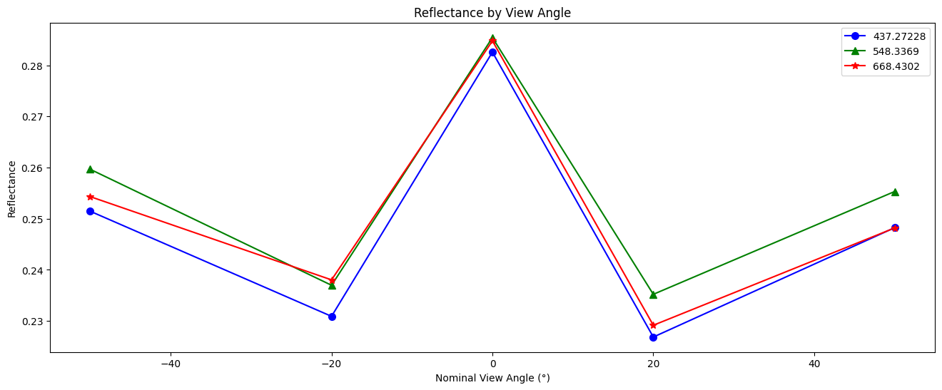
Create a line plot of the reflectance for each view angle and spectral channel on a selected pixel.
fig, ax = plt.subplots(1,1, figsize=(16, 6))
plot_data = [("b", "o"), ("g", "^"), ("r", "*")]
refl_pixel= refl[350,12] #select an arbitrary pixel
for wv_idx in range(3):
    wv = wavelengths_p[0, wavelengths_p_index[wv_idx]].values
    c, m = plot_data[wv_idx]
    ax.plot(
        angles.values,
        refl_pixel[:, wv_idx],
        color=c,
        marker=m,
        markersize=7,
        label=str(wv),
    )
ax.legend()
ax.set_xlabel("Nominal View Angle (°)")
ax.set_ylabel("Reflectance")
ax.set_title("Reflectance by View Angle")
plt.show()
You have completed the notebook giving a first look at SPEXone data. More notebooks are coming soon!