
PACE data visualization#
Author: Carina Poulin (NASA, SSAI). Prepared for the PACE Hackweek 2025.
An Earthdata Login account is required to access data from the NASA Earthdata system, including NASA ocean color data.
You need up to 4GB of memory to run this notebook
Summary#
This is an introduction to the visualization possibilities arising from PACE data, meant to give you ideas and tools to develop your own scientific data visualizations.
Learning Objectives#
At the end of this notebook you will know:
How to create a quick global map from OCI data
How to clean up your OCI dataset for visualizing
How to create a quick plot for a “transect”
How to interpolate the data
How to create an multi-variable RGB map with two datasets
Plot a timeline of the plankton types for a region of interest
Contents#
1. Setup#
Begin by importing all of the packages used in this notebook. If your kernel uses an environment defined following the guidance on the tutorials page, then the imports will be successful.
import cartopy.crs as ccrs
import cartopy.feature as cfeature
import earthaccess
import h5netcdf
import matplotlib.pyplot as plt
import numpy as np
import pandas as pd
import pyinterp.backends.xarray  # Module that handles the filling of undefined values.
import pyinterp.fill
import seaborn as sns
import xarray as xr
from matplotlib.patches import Rectangle
Set (and persist to your user profile on the host, if needed) your Earthdata Login credentials.
auth = earthaccess.login()
2. Search for Data#
For this example. we will be looking at a the month of July 2024.
tspan = ("2024-07-01", "2024-07-30")
We look for two different types of products. The Multiple Ordination ANAlysis, or MOANA, is a new hyperspectral algorithm that measures the abundance of three different types of phytoplankton in the Atlantic Ocean. Only daily MOANA products are availabla from earthaccess for the moment.
results_moana = earthaccess.search_data(
    short_name="PACE_OCI_L3M_MOANA",
    granule_name="*.DAY.*0p1deg*",  # Daily only for MOANA | Resolution: 0p1deg or 4 (for 4km)
    temporal=tspan,
)
The second type of product we look for here is one of the new land products. This one, the OCI vegetation indices, or LANDVI, indicates the presence of different plant pigments. We are interested in monthly data for this example.
results_land = earthaccess.search_data(
    short_name="PACE_OCI_L3M_LANDVI",
    temporal=tspan,
    granule_name="*.MO.*0p1deg*",  # Daily, 8-day or monthly: Day, 8D or MO | Resolution: 0p1deg or 0.4km
)
Here we will open the datasets.
path_moana = earthaccess.open(results_moana)
Since we are combining multiple files, we are using the open_mfdataset function and indicating that we want to concatenate the data by date.
dataset_moana = xr.open_mfdataset(path_moana, combine="nested", concat_dim="date")
dataset_moana
<xarray.Dataset> Size: 554MB
Dimensions:          (date: 30, lat: 1400, lon: 1100, rgb: 3, eightbitcolor: 256)
Coordinates:
  * lat              (lat) float32 6kB 69.95 69.85 69.75 ... -69.85 -69.95
  * lon              (lon) float32 4kB -84.95 -84.85 -84.75 ... 24.85 24.95
Dimensions without coordinates: date, rgb, eightbitcolor
Data variables:
    prococcus_moana  (date, lat, lon) float32 185MB dask.array<chunksize=(1, 512, 1024), meta=np.ndarray>
    syncoccus_moana  (date, lat, lon) float32 185MB dask.array<chunksize=(1, 512, 1024), meta=np.ndarray>
    picoeuk_moana    (date, lat, lon) float32 185MB dask.array<chunksize=(1, 512, 1024), meta=np.ndarray>
    palette          (date, rgb, eightbitcolor) uint8 23kB dask.array<chunksize=(1, 3, 256), meta=np.ndarray>
Attributes: (12/62)
    product_name:                      PACE_OCI.20240701.L3m.DAY.MOANA.V3_0.0...
    instrument:                        OCI
    title:                             OCI Level-3 Standard Mapped Image
    project:                           Ocean Biology Processing Group (NASA/G...
    platform:                          PACE
    source:                            satellite observations from OCI-PACE
    ...                                ...
    cdm_data_type:                     grid
    identifier_product_doi_authority:  http://dx.doi.org
    identifier_product_doi:            10.5067/PACE/OCI/L3M/MOANA/3.0
    data_bins:                         136177
    data_minimum:                      -inf
data_maximum: infpath_land = earthaccess.open(results_land)
dataset_land = xr.open_mfdataset(
    path_land,
    combine="nested",
    concat_dim="date",
)
dataset_land
<xarray.Dataset> Size: 259MB
Dimensions:  (date: 1, lat: 1800, lon: 3600, rgb: 3, eightbitcolor: 256)
Coordinates:
  * lat      (lat) float32 7kB 89.95 89.85 89.75 89.65 ... -89.75 -89.85 -89.95
  * lon      (lon) float32 14kB -179.9 -179.9 -179.8 ... 179.8 179.9 180.0
Dimensions without coordinates: date, rgb, eightbitcolor
Data variables:
    ndvi     (date, lat, lon) float32 26MB dask.array<chunksize=(1, 512, 1024), meta=np.ndarray>
    evi      (date, lat, lon) float32 26MB dask.array<chunksize=(1, 512, 1024), meta=np.ndarray>
    ndwi     (date, lat, lon) float32 26MB dask.array<chunksize=(1, 512, 1024), meta=np.ndarray>
    ndii     (date, lat, lon) float32 26MB dask.array<chunksize=(1, 512, 1024), meta=np.ndarray>
    cci      (date, lat, lon) float32 26MB dask.array<chunksize=(1, 512, 1024), meta=np.ndarray>
    ndsi     (date, lat, lon) float32 26MB dask.array<chunksize=(1, 512, 1024), meta=np.ndarray>
    pri      (date, lat, lon) float32 26MB dask.array<chunksize=(1, 512, 1024), meta=np.ndarray>
    cire     (date, lat, lon) float32 26MB dask.array<chunksize=(1, 512, 1024), meta=np.ndarray>
    car      (date, lat, lon) float32 26MB dask.array<chunksize=(1, 512, 1024), meta=np.ndarray>
    mari     (date, lat, lon) float32 26MB dask.array<chunksize=(1, 512, 1024), meta=np.ndarray>
    palette  (date, rgb, eightbitcolor) uint8 768B dask.array<chunksize=(1, 3, 256), meta=np.ndarray>
Attributes: (12/62)
    product_name:                      PACE_OCI.20240701_20240731.L3m.MO.LAND...
    instrument:                        OCI
    title:                             OCI Level-3 Standard Mapped Image
    project:                           Ocean Biology Processing Group (NASA/G...
    platform:                          PACE
    source:                            satellite observations from OCI-PACE
    ...                                ...
    cdm_data_type:                     grid
    identifier_product_doi_authority:  http://dx.doi.org
    identifier_product_doi:            10.5067/PACE/OCI/L3M/LANDVI/3.0
    data_bins:                         1507329
    data_minimum:                      -9.354128
data_maximum: 24.8606833. Make a quick map with Xarray#
Lets make a very quick map using xr.plot. All we need is to indicate the variable we want to plot and because our dataset contains multiple date, we indicate the index of one date in brackets with [0].
plot = dataset_moana["prococcus_moana"][0].plot.imshow()
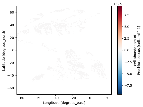
Notice that we do not see much. In this case, the dataset contains outliers. If we just want to make a quick plot, we can remove outliers with robust=true.
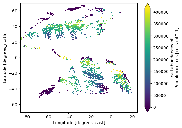
plot = dataset_moana["prococcus_moana"][0].plot.imshow(robust="true")
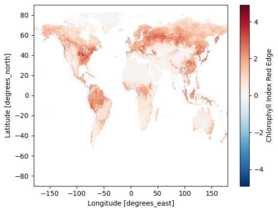
We can do another quick plot for the land vegetation indices dataset. Notice the map is much more complete, which is expected in monthly compared to daily products.
plot = dataset_land["cire"][0].plot.imshow()
4. Clean up the dataset#
Because we want to do statistics on the data and not only draw a quick plot, we are going to clean up the dataset. Thankfully, the dataset comes with atttributes that indicate valid_max and valid_min values to guide us.
dataset_moana
<xarray.Dataset> Size: 554MB
Dimensions:          (date: 30, lat: 1400, lon: 1100, rgb: 3, eightbitcolor: 256)
Coordinates:
  * lat              (lat) float32 6kB 69.95 69.85 69.75 ... -69.85 -69.95
  * lon              (lon) float32 4kB -84.95 -84.85 -84.75 ... 24.85 24.95
Dimensions without coordinates: date, rgb, eightbitcolor
Data variables:
    prococcus_moana  (date, lat, lon) float32 185MB dask.array<chunksize=(1, 512, 1024), meta=np.ndarray>
    syncoccus_moana  (date, lat, lon) float32 185MB dask.array<chunksize=(1, 512, 1024), meta=np.ndarray>
    picoeuk_moana    (date, lat, lon) float32 185MB dask.array<chunksize=(1, 512, 1024), meta=np.ndarray>
    palette          (date, rgb, eightbitcolor) uint8 23kB dask.array<chunksize=(1, 3, 256), meta=np.ndarray>
Attributes: (12/62)
    product_name:                      PACE_OCI.20240701.L3m.DAY.MOANA.V3_0.0...
    instrument:                        OCI
    title:                             OCI Level-3 Standard Mapped Image
    project:                           Ocean Biology Processing Group (NASA/G...
    platform:                          PACE
    source:                            satellite observations from OCI-PACE
    ...                                ...
    cdm_data_type:                     grid
    identifier_product_doi_authority:  http://dx.doi.org
    identifier_product_doi:            10.5067/PACE/OCI/L3M/MOANA/3.0
    data_bins:                         136177
    data_minimum:                      -inf
data_maximum: infdataset_moana["prococcus_moana"] = dataset_moana["prococcus_moana"].clip(
min=dataset_moana["prococcus_moana"].attrs["valid_min"],
max=dataset_moana["prococcus_moana"].attrs["valid_max"],
)
dataset_moana["syncoccus_moana"] = dataset_moana["syncoccus_moana"].clip(
min=dataset_moana["syncoccus_moana"].attrs["valid_min"],
max=dataset_moana["syncoccus_moana"].attrs["valid_max"],
)
dataset_moana["picoeuk_moana"] = dataset_moana["picoeuk_moana"].clip(
min=dataset_moana["picoeuk_moana"].attrs["valid_min"],
max=dataset_moana["picoeuk_moana"].attrs["valid_max"],
)
dataset_land["cire"] = dataset_land["cire"].clip(
min=dataset_land["cire"].attrs["valid_min"],
max=dataset_land["cire"].attrs["valid_max"],
)
dataset_land["car"] = dataset_land["car"].clip(
min=dataset_land["car"].attrs["valid_min"],
max=dataset_land["car"].attrs["valid_max"],
)
dataset_land["mari"] = dataset_land["mari"].clip(
min=dataset_land["mari"].attrs["valid_min"],
max=dataset_land["mari"].attrs["valid_max"],
)
We will also remove the variables we will not be using for this example with drop_vars.
dataset_phy = dataset_moana.drop_vars(["palette"])
dataset_veg = dataset_land.drop_vars(
["palette", "ndvi", "evi", "ndwi", "ndii", "cci", "ndsi", "pri"]
)
Average#
Let’s calculate the average of our datasets so that we have the equivalent monthly data for both (since we have one month of data).
dataset_phy = dataset_phy.mean("date")
dataset_veg = dataset_veg.mean("date")
5. Plot data from a transect#
We can have a quick look at the values for a “transect” at a selected longitude using sel and method='nearest'
lon_val = -30
transect = dataset_phy.sel(lon=lon_val, method="nearest")
Making a quick plot with latitudes on the y axis.
plot = transect["syncoccus_moana"].plot(y="lat")
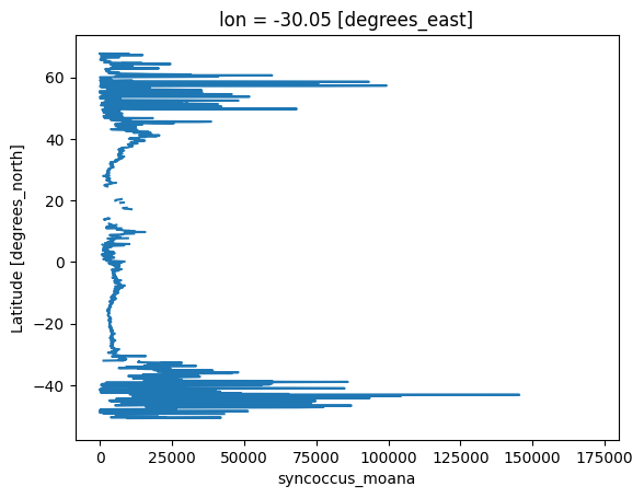
We can see there are some values missing, we can interpolate the data if we want to, but it is entirely optional.
6. Interpolate the data#
MOANA (Optional)#
Here we offer the option of interpolating the data. This can be useful for filling gaps in the dataset, which can make visualizations smoother. Consider how it affects your statistics before using.
plot = dataset_phy["syncoccus_moana"].plot.imshow(robust="true")
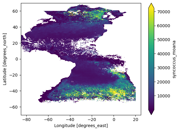
The margin parameter is the number of pixels on the X and Y axes to be considered in the calculation.
margin = 1
We need to first create a grid.
grid_pro = pyinterp.backends.xarray.Grid2D(dataset_phy["prococcus_moana"])
grid_syn = pyinterp.backends.xarray.Grid2D(dataset_phy["syncoccus_moana"])
grid_pic = pyinterp.backends.xarray.Grid2D(dataset_phy["picoeuk_moana"])
Then interpolate the gridded data and transpose it back into its shape.
pro = pyinterp.fill.loess(grid_pro, nx=margin, ny=margin)
syn = pyinterp.fill.loess(grid_syn, nx=margin, ny=margin)
pic = pyinterp.fill.loess(grid_pic, nx=margin, ny=margin)
dataset_phy["prococcus_moana"][...] = pro.transpose()
dataset_phy["syncoccus_moana"][...] = syn.transpose()
dataset_phy["picoeuk_moana"][...] = pic.transpose()
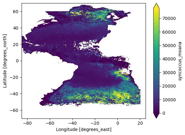
If we have a look at the transect again, we can see that some of the values have been filled in by the interpolation.
plot = dataset_phy["syncoccus_moana"].plot.imshow(robust="true")
Interpolation Land (Optional)#
We separated the land and MOANA interpolations to allow you to choose different interpolations for each.
margin_v = 1
grid_cire = pyinterp.backends.xarray.Grid2D(dataset_veg["cire"])
grid_car = pyinterp.backends.xarray.Grid2D(dataset_veg["car"])
grid_mari = pyinterp.backends.xarray.Grid2D(dataset_veg["mari"])
cir = pyinterp.fill.loess(grid_cire, nx=margin_v, ny=margin_v)
car = pyinterp.fill.loess(grid_car, nx=margin_v, ny=margin_v)
mar = pyinterp.fill.loess(grid_mari, nx=margin_v, ny=margin_v)
dataset_veg["cire"][...] = cir.transpose()
dataset_veg["car"][...] = car.transpose()
dataset_veg["mari"][...] = mar.transpose()
Normalize data#
We normalize in order to visualize and compare multiple variables together.
dataset_norm = dataset_phy.astype(np.float64)
dataset_norm = (
(dataset_phy - dataset_phy.min())
/ (dataset_phy.max() - dataset_phy.min())
)
dataset_v_norm = dataset_veg.astype(np.float64)
dataset_v_norm = (
(dataset_veg - dataset_veg.min())
/ (dataset_veg.max() - dataset_veg.min())
)
data_norm = dataset_norm.to_dataarray()
data_norm_v = dataset_v_norm.to_dataarray()
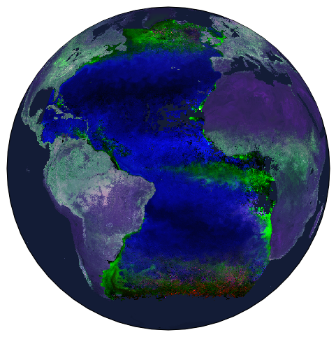
7. Make a multi-variable RBG map with two datasets#
We will use the plot.imshow function to represent our variables by intensities of Red, Green, and Blue. We can use sel to reorder the dataset because the visualization will go in the order of Red, Green, and Blue.
data_norm = data_norm.sel(
variable=["syncoccus_moana", "picoeuk_moana", "prococcus_moana"]
)
data_norm_v = data_norm_v.sel(variable=["car", "cire", "mari"])
This is an example of how to show multiple variables from two different datasets on the same map. We can choose the color the land and ocean backgrounds using cfeature.NaturalEarthFeature. We also order the overlapping layers using zorder, the higher the number, the higher the layer is. fig.patch.set_alpha(0.0) is used to remove the background of the image when saving as a png.
fig = plt.figure(figsize=(6, 6))
ax1 = fig.add_subplot(projection=ccrs.Orthographic(-30, 0), facecolor="#080c17")
ax1.add_feature(
cfeature.NaturalEarthFeature(
"physical",
"ocean",
"110m",
edgecolor="face",
facecolor="#131c36",
),
alpha=1,
zorder=1,
)
ax1.add_feature(
cfeature.NaturalEarthFeature(
"physical",
"land",
"110m",
edgecolor="face",
facecolor="#131c36",
),
alpha=0.85,
zorder=2,
)
ax2 = data_norm.plot.imshow(
transform=ccrs.PlateCarree(), interpolation="none", zorder=3
)
ax3 = data_norm_v.plot.imshow(
transform=ccrs.PlateCarree(), interpolation="none", zorder=4
)
fig.patch.set_alpha(0.0)
plt.show()
We export the figure of a chosen name, format and resolution (dpi). str(tspan) adds the date range to the name, you can use other variables in strings in the same way.
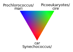
We can create a RGB ternary legend for our map. This was shamelessly inspired by the EDMW EarthData Workshop 2025 , check their GitHub repo for even more inspiration for PACE visualizations!
size = 200
x = np.linspace(-1, 1, size)
y = np.linspace(-1, 1, size)
X, Y = np.meshgrid(x, y)
# Equilateral triangle with center at origin
# Barycentric coordinates
R = (-Y + 0.65) / 0.97
G = (X * 0.866 + Y * 0.5 + 0.32) / 0.97
B = (-X * 0.866 + Y * 0.5 + 0.32) / 0.97
# Only show points inside triangle
mask = (R >= 0) & (G >= 0) & (B >= 0)
rgb = np.ones((size, size, 3))
rgb[mask] = np.stack([R[mask], G[mask], B[mask]], axis=1)
plt.figure(figsize=(2.5, 2.5))
plt.imshow(rgb, extent=[-1, 1, -1, 1], origin="lower")
plt.text(0, -0.9, "Synechococcus/", ha="center", va="center", fontsize=9)
plt.text(0, -0.75, "car", ha="center", va="center", fontsize=9)
plt.text(-0.8, 0.9, "Prochlorococcus/", ha="center", va="center", fontsize=9)
plt.text(-0.8, 0.75, "mari", ha="center", va="center", fontsize=9)
plt.text(0.8, 0.9, "Picoeukaryotes/", ha="center", va="center", fontsize=9)
plt.text(0.8, 0.75, "cire", ha="center", va="center", fontsize=9)
plt.axis("off")
plt.tight_layout()
plt.show()
Clipping input data to the valid range for imshow with RGB data ([0..1] for floats or [0..255] for integers). Got range [1.0361083769357971e-05..1.3235352017821065].
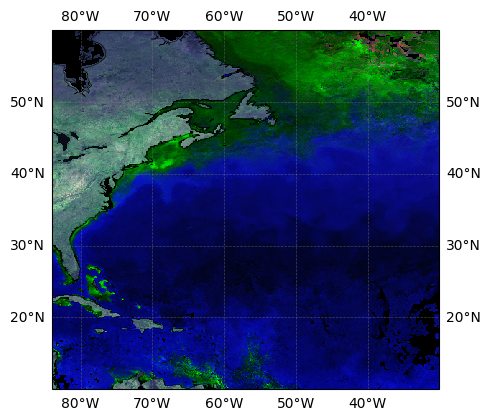
If we want more geographical information on our map, we can add grids, coastlines and coordinates. extent allows us to choose the coordinates that limit our map. fig.add_subplot(projection=ccrs.PlateCarree() indicates the projection, PlateCarree in this case. We need to indicate this projection when adding grid lines.
fig = plt.figure(figsize=(5, 5))
extent = [-84, -30, 10, 60]
ax1 = fig.add_subplot(projection=ccrs.PlateCarree(), facecolor="#080c17")
ax1.gridlines(
crs=ccrs.PlateCarree(),
draw_labels=True,
linewidth=0.5,
color="gray",
alpha=0.5,
linestyle="--",
zorder=4,
)
ax1.coastlines(linewidth=0.4, color="black", zorder=3)
ax1.add_feature(
cfeature.NaturalEarthFeature(
"physical",
"ocean",
"110m",
edgecolor="face",
facecolor="black",
),
alpha=1,
zorder=0,
)
# ax1.add_feature(cfeature.NaturalEarthFeature('physical', 'land', '110m', edgecolor='face', facecolor='#131c36'), alpha=0.85, zorder=5)
ax1.set_extent(extent, crs=ccrs.PlateCarree())
ax2 = data_norm.plot.imshow(
transform=ccrs.PlateCarree(), interpolation="none", zorder=1.5
)
ax3 = data_norm_v.plot.imshow(
transform=ccrs.PlateCarree(), interpolation="none", zorder=1
)
plt.show()
8. Plot a timeline of the plankton types for a region of interest#
We are going to use what we just learned to create a timeline for a chosen area. First, we will get data for a whole year.
Get data#
tspan = ("2024-04-01", "2025-03-31")
results_moana = earthaccess.search_data(
short_name="PACE_OCI_L3M_MOANA",
granule_name="*.Day.*0p1deg*", # Daily: Day | Resolution: 0p1deg or 4 (for 4km)
temporal=tspan,
)
Since we want to draw a timeline, we will get the date information from the dataset’s attribute with the new function we are creating: time_from_attr.
def time_from_attr(ds):
"""Set the time attribute as a dataset variable
Args:
ds: a dataset corresponding to one or multiple Level-2 granules
Returns:
the dataset with a scalar "time" coordinate
"""
datetime = ds.attrs["time_coverage_start"].replace("Z", "")
ds["date"] = ((), np.datetime64(datetime, "ns"))
ds = ds.set_coords("date")
return ds
path_files = earthaccess.open(results_moana)
We use time_from_attr in the preprocess parameter of xr.open_mfdataset. We then can see the date coordinate added to the dataset.
dataset_moana = xr.open_mfdataset(
path_files, preprocess=time_from_attr, combine="nested", concat_dim="date"
)
dataset_moana
<xarray.Dataset> Size: 6GB
Dimensions: (date: 346, lat: 1400, lon: 1100, rgb: 3,
eightbitcolor: 256)
Coordinates:
* lat (lat) float32 6kB 69.95 69.85 69.75 ... -69.85 -69.95
* lon (lon) float32 4kB -84.95 -84.85 -84.75 ... 24.85 24.95
* date (date) datetime64[ns] 3kB 2024-04-01T11:01:27 ... 2025-0...
Dimensions without coordinates: rgb, eightbitcolor
Data variables:
prococcus_moana (date, lat, lon) float32 2GB dask.array<chunksize=(1, 512, 1024), meta=np.ndarray>
syncoccus_moana (date, lat, lon) float32 2GB dask.array<chunksize=(1, 512, 1024), meta=np.ndarray>
picoeuk_moana (date, lat, lon) float32 2GB dask.array<chunksize=(1, 512, 1024), meta=np.ndarray>
palette (date, rgb, eightbitcolor) uint8 266kB dask.array<chunksize=(1, 3, 256), meta=np.ndarray>
Attributes: (12/62)
product_name: PACE_OCI.20240401.L3m.DAY.MOANA.V3_0.0...
instrument: OCI
title: OCI Level-3 Standard Mapped Image
project: Ocean Biology Processing Group (NASA/G...
platform: PACE
source: satellite observations from OCI-PACE
... ...
cdm_data_type: grid
identifier_product_doi_authority: http://dx.doi.org
identifier_product_doi: 10.5067/PACE/OCI/L3M/MOANA/3.0
data_bins: 166600
data_minimum: -inf
data_maximum: infClean up data#
We then clean up our dataset using the built-in valid_min and valid_max values and remove the palette variable that we will not be using.
dataset_moana["prococcus_moana"] = dataset_moana["prococcus_moana"].clip(
    min=dataset_moana["prococcus_moana"].attrs["valid_min"],
    max=dataset_moana["prococcus_moana"].attrs["valid_max"],
)
dataset_moana["syncoccus_moana"] = dataset_moana["syncoccus_moana"].clip(
    min=dataset_moana["syncoccus_moana"].attrs["valid_min"],
    max=dataset_moana["syncoccus_moana"].attrs["valid_max"],
)
dataset_moana["picoeuk_moana"] = dataset_moana["picoeuk_moana"].clip(
    min=dataset_moana["picoeuk_moana"].attrs["valid_min"],
    max=dataset_moana["picoeuk_moana"].attrs["valid_max"],
)
dataset_phy = dataset_moana.drop_vars(["palette"])
Let’s average, normalize and reorder our dataset as seen in the previous example.
dataset_phy_mean = dataset_phy.mean("date")
dataset_phy_mean = dataset_phy_mean.astype(np.float64)
dataset_norm = (
    (dataset_phy_mean - dataset_phy_mean.min())
    / (dataset_phy_mean.max() - dataset_phy_mean.min())
)
data_norm = dataset_norm.to_dataarray()
data_norm = data_norm.sel(
    variable=["syncoccus_moana", "picoeuk_moana", "prococcus_moana"]
)
Select and visualize our region of interest#
For this exercise, we want to select an area of interest that we will analyze with our timeline. Note that MOANA only works in the Atlantic Ocean for the moment.
Use signs appropriately:
North latitude is positive, South latitude is negative. East longitude is positive, West longitude is negative.
west_lon = -15
south_lat = 50
east_lon = -12
north_lat = 53
Here is an entirely optional check for your coordinates.
if south_lat > north_lat:
    south_lat, north_lat = north_lat, south_lat
    print("Warning: South latitude was north of north latitude. Values swapped.")

if west_lon > east_lon:
    if abs(west_lon - east_lon) > 180:
        print("Box appears to cross the antimeridian (180/-180 line).")
    else:
        west_lon, east_lon = east_lon, west_lon
        print("Warning: West longitude was east of east longitude. Values swapped.")

lat_ascending = dataset_phy["lat"][1] > dataset_phy["lat"][0]
lon_ascending = dataset_phy.lon[1] > dataset_phy.lon[0]

if lat_ascending:
    lat_min = south_lat
    lat_max = north_lat
else:
    lat_min = north_lat
    lat_max = south_lat

if lon_ascending:
    lon_min = west_lon
    lon_max = east_lon
else:
    lon_min = east_lon
    lon_max = west_lon
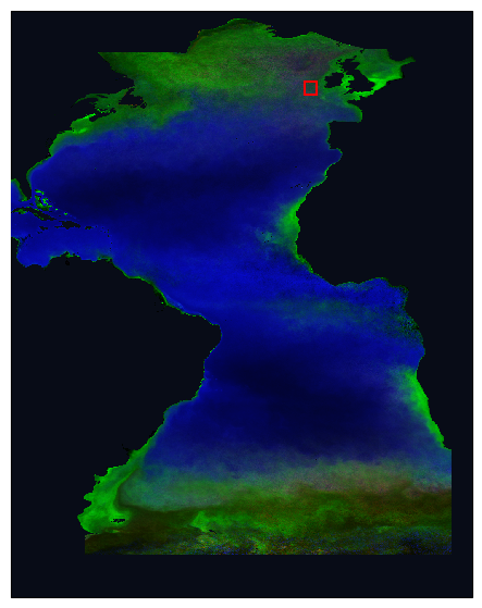
Then we plot a rectangle around our area of interest on our RGB map. We can try to choose an area that is at the edge of a population to see the changes in time.
fig = plt.figure(figsize=(7, 7))
ax1 = fig.add_subplot(projection=ccrs.PlateCarree(), facecolor="#080c17")
ax2 = data_norm.plot.imshow(
    transform=ccrs.PlateCarree(), interpolation="none", zorder=3
)

# Add bounding box
ax1.add_patch(
    Rectangle(
        (lon_min, lat_min),
        lon_max - lon_min,
        lat_max - lat_min,
        edgecolor="red",
        facecolor="none",
        linewidth=1.5,
        transform=ccrs.PlateCarree(),
        zorder=4,
    )
)
plt.show()
We then select the data within our area of interest.
tl = dataset_phy.sel(lat=slice(lat_min, lat_max), lon=slice(lon_min, lon_max))
tl
<xarray.Dataset> Size: 4MB
Dimensions:          (date: 346, lat: 30, lon: 30)
Coordinates:
  * lat              (lat) float32 120B 52.95 52.85 52.75 ... 50.25 50.15 50.05
  * lon              (lon) float32 120B -14.95 -14.85 -14.75 ... -12.15 -12.05
  * date             (date) datetime64[ns] 3kB 2024-04-01T11:01:27 ... 2025-0...
Data variables:
    prococcus_moana  (date, lat, lon) float32 1MB dask.array<chunksize=(1, 30, 30), meta=np.ndarray>
    syncoccus_moana  (date, lat, lon) float32 1MB dask.array<chunksize=(1, 30, 30), meta=np.ndarray>
    picoeuk_moana    (date, lat, lon) float32 1MB dask.array<chunksize=(1, 30, 30), meta=np.ndarray>
Attributes: (12/62)
    product_name:                      PACE_OCI.20240401.L3m.DAY.MOANA.V3_0.0...
    instrument:                        OCI
    title:                             OCI Level-3 Standard Mapped Image
    project:                           Ocean Biology Processing Group (NASA/G...
    platform:                          PACE
    source:                            satellite observations from OCI-PACE
    ...                                ...
    cdm_data_type:                     grid
    identifier_product_doi_authority:  http://dx.doi.org
    identifier_product_doi:            10.5067/PACE/OCI/L3M/MOANA/3.0
    data_bins:                         166600
    data_minimum:                      -inf
data_maximum: infPlot the timelines with spatial averages and standard deviations#
We want to run some statistics within our area. Here we are looking at the average and standard deviation for each group.
region_mean = tl.mean(dim=["lat", "lon"])
region_std = tl.std(dim=["lat", "lon"])
region_mean.load()
region_std.load()
<xarray.Dataset> Size: 7kB
Dimensions:          (date: 346)
Coordinates:
  * date             (date) datetime64[ns] 3kB 2024-04-01T11:01:27 ... 2025-0...
Data variables:
    prococcus_moana  (date) float32 1kB 2.015e+04 3.554e+04 ... 3.443e+04
    syncoccus_moana  (date) float32 1kB 1.202e+04 9.674e+03 ... 2.786e+04
picoeuk_moana (date) float32 1kB 1.193e+03 1.653e+03 ... 1.335e+03We can now plot our timeline. We are going to plot the standard deviations as a shaded area around our mean with fill_between. We are using seaborn as sns to get their built-in plot styling options. It can be good to define some style elements, like markersize, ahead to avoid repeating them, but they can be changed for any individual dataset if needed.
In this case, we also are drawing a second y axis with twinx for prochlorococcus, which has much higher concentrations than synechococcus and picoeukaryotes.
fig, ax1 = plt.subplots(figsize=(10, 5))

# Style
linewidth = 1
markersize = 2
marker = "o"
sns.set_style("white")
palette = sns.color_palette("husl", 3)

# Left y-axis plots
ax1.plot(
    region_mean["syncoccus_moana"].date,
    region_mean["syncoccus_moana"],
    color=palette[0],
    marker=marker,
    label="Syn",
    linewidth=linewidth,
    markersize=markersize,
)
ax1.fill_between(
    region_mean["syncoccus_moana"].date,
    region_mean["syncoccus_moana"] - region_std["syncoccus_moana"],
    region_mean["syncoccus_moana"] + region_std["syncoccus_moana"],
    color=palette[0],
    alpha=0.2,
)

ax1.plot(
    region_mean["picoeuk_moana"].date,
    region_mean["picoeuk_moana"],
    color=palette[1],
    marker=marker,
    label="Pico",
    linewidth=linewidth,
    markersize=markersize,
)
ax1.fill_between(
    region_mean["picoeuk_moana"].date,
    region_mean["picoeuk_moana"] - region_std["picoeuk_moana"],
    region_mean["picoeuk_moana"] + region_std["picoeuk_moana"],
    color=palette[1],
    alpha=0.2,
)

# Right y-axis plot
ax2 = ax1.twinx()
ax2.plot(
    region_mean["prococcus_moana"].date,
    region_mean["prococcus_moana"],
    color=palette[2],
    marker=marker,
    linestyle="--",
    label="Pro",
    linewidth=linewidth,
    markersize=markersize,
)
ax2.fill_between(
    region_mean["prococcus_moana"].date,
    region_mean["prococcus_moana"] - region_std["prococcus_moana"],
    region_mean["prococcus_moana"] + region_std["prococcus_moana"],
    color=palette[2],
    alpha=0.2,
)

ax1.legend(loc="upper left")
ax2.legend(loc="upper right")

ax1.set_ylabel("Synechococcus and Picoeukaryotes (cells/ml)")
ax2.set_ylabel("Prochlorococcus (cells/ml)")
ax1.set_xlabel("Date")

plt.title("MOANA Phytoplankton Timeline")
plt.tight_layout()
plt.show()
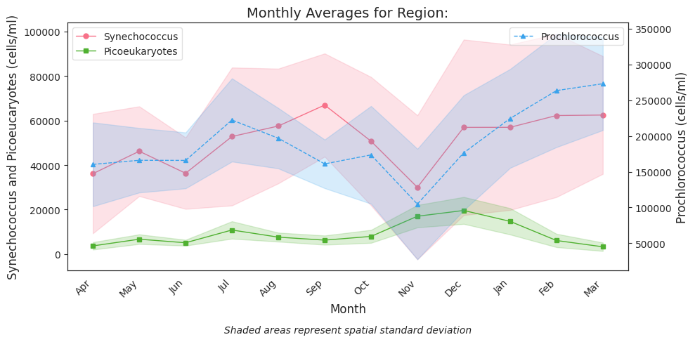
Plot monthly averages#
Now this looks a little noisy with the daily data, so let’s make monthly means within our region with groupby.mean.
monthly_means = region_mean.groupby("date.month").mean()
monthly_stds = region_std.groupby("date.month").mean()
monthly_stds.load()
monthly_means.load()
<xarray.Dataset> Size: 240B
Dimensions:          (month: 12)
Coordinates:
  * month            (month) int64 96B 1 2 3 4 5 6 7 8 9 10 11 12
Data variables:
    prococcus_moana  (month) float32 48B 1.602e+05 1.66e+05 ... 2.729e+05
    syncoccus_moana  (month) float32 48B 3.614e+04 4.621e+04 ... 6.247e+04
picoeuk_moana (month) float32 48B 3.692e+03 6.703e+03 ... 3.291e+03We can now plot our monthly averages. Note that we will manually indicate the month names here.
fig, ax1 = plt.subplots(figsize=(10, 5))

# Style
linewidth = 1
markersize = 5
sns.set_style("white")
palette = sns.color_palette("husl", 3)

months = monthly_means["month"].values
month_names = [
    "Apr",
    "May",
    "Jun",
    "Jul",
    "Aug",
    "Sep",
    "Oct",
    "Nov",
    "Dec",
    "Jan",
    "Feb",
    "Mar",
]  # Manually change if different range

# Left axis
ax1.plot(
    months,
    monthly_means["syncoccus_moana"].values,
    "o-",
    color=palette[0],
    label="Synechococcus",
    linewidth=linewidth,
    markersize=markersize,
)
ax1.fill_between(
    months,
    monthly_means["syncoccus_moana"] - monthly_stds["syncoccus_moana"],
    monthly_means["syncoccus_moana"] + monthly_stds["syncoccus_moana"],
    color=palette[0],
    alpha=0.2,
)

ax1.plot(
    months,
    monthly_means["picoeuk_moana"].values,
    "s-",
    color=palette[1],
    label="Picoeukaryotes",
    linewidth=linewidth,
    markersize=markersize,
)
ax1.fill_between(
    months,
    monthly_means["picoeuk_moana"] - monthly_stds["picoeuk_moana"],
    monthly_means["picoeuk_moana"] + monthly_stds["picoeuk_moana"],
    color=palette[1],
    alpha=0.2,
)

# Second y-axis
ax2 = ax1.twinx()
ax2.plot(
    months,
    monthly_means["prococcus_moana"].values,
    "^--",
    color=palette[2],
    label="Prochlorococcus",
    linewidth=linewidth,
    markersize=markersize,
)
ax2.fill_between(
    months,
    monthly_means["prococcus_moana"] - monthly_stds["prococcus_moana"],
    monthly_means["prococcus_moana"] + monthly_stds["prococcus_moana"],
    color=palette[2],
    alpha=0.2,
)

# Add labels, titles and improve x-axis
ax1.set_xlabel("Month", fontsize=12)
ax1.set_ylabel("Synechococcus and Picoeucaryotes (cells/ml)", fontsize=12)
ax2.set_ylabel("Prochlorococcus (cells/ml)", fontsize=12)
ax1.set_xticks(range(1, 13))  # manually change if different months on x axis
ax1.set_xticklabels(month_names)

ax1.legend(loc="upper left", frameon=True, framealpha=0.6)
ax2.legend(loc="upper right", frameon=True, framealpha=0.6)

plt.title(f"Monthly Averages for Region:", fontsize=14)
fig.text(
    0.5,
    0.01,
    "Shaded areas represent spatial standard deviation",
    ha="center",
    fontsize=10,
    style="italic",
)

plt.setp(ax1.get_xticklabels(), rotation=45, ha="right")

plt.tight_layout(rect=[0, 0.03, 1, 0.97])  # Adjust layout to make room for the note
plt.show()
You have completed the notebook on PACE data visualization!