
Visualize Data from the Hyper-Angular Rainbow Polarimeter (HARP2)#
Authors: Sean Foley (NASA, MSU), Meng Gao (NASA, SSAI), Ian Carroll (NASA, UMBC)
The following notebooks are prerequisites for this tutorial.
Learn with OCI: Data Access
An Earthdata Login account is required to access data from the NASA Earthdata system, including NASA ocean color data.
Summary#
PACE has two Multi-Angle Polarimeters (MAPs): SPEXone and HARP2. These sensors offer unique data, which is useful for its own scientific purposes and also complements the data from OCI. Working with data from the MAPs requires you to understand both multi-angle data and some basic concepts about polarization. This notebook will walk you through some basic understanding and visualizations of multi-angle polarimetry, so that you feel comfortable incorporating this data into your future projects.
Learning Objectives#
At the end of this notebook you will know:
How to acquire data from HARP2
How to plot geolocated imagery
Some basic concepts about polarization
How to make animations of multi-angle data
Contents#
1. Setup#
Begin by importing all of the packages used in this notebook. If your kernel uses an environment defined following the guidance on the tutorials page, then the imports will be successful.
import cartopy.crs as ccrs
import earthaccess
import matplotlib.pyplot as plt
import numpy as np
import xarray as xr
from matplotlib import animation
from scipy.ndimage import gaussian_filter1d
auth = earthaccess.login(persist=True)
2. Get Level-1C Data#
Download a granule of HARP2 Level-1C data, which comes from the collection with short-name “PACE_HARP2_L1C_SCI”. Level-1C corresponds to geolocated imagery. This means the imagery coming from the satellite has been calibrated and assigned to locations on the Earth’s surface. Note that access might take a while, depending on the speed of your internet connection, and the progress bar will seem frozen because we’re only looking at one file.
results = earthaccess.search_data(
    short_name="PACE_HARP2_L1C_SCI",
    # temporal=("2025-07-20", "2025-07-20"),
    temporal=("2025-01-09T20:00:20", "2025-01-09T20:00:21"),
    count=1
)
paths = earthaccess.open(results)
If you see HTTPFileSystem in the output when you display paths, then earthaccess has determined that you do not have
direct access to the NASA Earthdata Cloud.
It may be wrong.
prod = xr.open_dataset(paths[0])
view = xr.open_dataset(paths[0], group="sensor_views_bands").squeeze()
geo = xr.open_dataset(paths[0], group="geolocation_data").set_coords(
    ["longitude", "latitude"]
)
obs = xr.open_dataset(paths[0], group="observation_data").squeeze()
The prod dataset, as usual for OB.DAAC products, contains attributes but no variables. Merge it with the “observation_data” and “geolocation_data”, setting latitude and longitude as auxiliary (e.e. non-index) coordinates, to get started.
dataset = xr.merge((prod, obs, geo))
dataset
<xarray.Dataset> Size: 1GB
Dimensions:                 (bins_along_track: 395, bins_across_track: 519,
                             number_of_views: 90)
Coordinates:
    longitude               (bins_along_track, bins_across_track) float32 820kB ...
    latitude                (bins_along_track, bins_across_track) float32 820kB ...
Dimensions without coordinates: bins_along_track, bins_across_track,
                                number_of_views
Data variables: (12/20)
    number_of_observations  (bins_along_track, bins_across_track, number_of_views) float32 74MB ...
    qc                      (bins_along_track, bins_across_track, number_of_views) float32 74MB ...
    i                       (bins_along_track, bins_across_track, number_of_views) float32 74MB ...
    q                       (bins_along_track, bins_across_track, number_of_views) float32 74MB ...
    u                       (bins_along_track, bins_across_track, number_of_views) float32 74MB ...
    dolp                    (bins_along_track, bins_across_track, number_of_views) float32 74MB ...
    ...                      ...
    sensor_zenith_angle     (bins_along_track, bins_across_track, number_of_views) float32 74MB ...
    sensor_azimuth_angle    (bins_along_track, bins_across_track, number_of_views) float32 74MB ...
    solar_zenith_angle      (bins_along_track, bins_across_track, number_of_views) float32 74MB ...
    solar_azimuth_angle     (bins_along_track, bins_across_track, number_of_views) float32 74MB ...
    scattering_angle        (bins_along_track, bins_across_track, number_of_views) float32 74MB ...
    rotation_angle          (bins_along_track, bins_across_track, number_of_views) float32 74MB ...
Attributes: (12/84)
    title:                              PACE HARP2 Level-1C Data
    instrument:                         HARP2
    product_name:                       PACE_HARP2.20250109T200019.L1C.V3.5km.nc
    processing_level:                   L1C
    Conventions:                        CF-1.10
    hipp_version:                       v4.3
    ...                                 ...
    harp_time_offset:                   0.0
    processing_status:                  Completed
    history:                            Processed by HIPP version: 4.3\n[2025...
    processing_version:                 3
    identifier_product_doi_authority:   https://dx.doi.org
identifier_product_doi: 10.5067/PACE/HARP2/L1C/SCI/33. Understanding Multi-Angle Data#
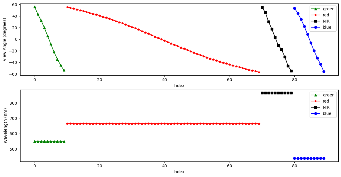
HARP2 is a multi-spectral sensor, like OCI, with 4 spectral bands. These roughly correspond to green, red, near infrared (NIR), and blue (in that order). HARP2 is also multi-angle. These angles are with respect to the satellite track. Essentially, HARP2 is always looking ahead, looking behind, and everywhere in between. The number of angles varies per sensor. The red band has 60 angles, while the green, blue, and NIR bands each have 10.
In the HARP2 data, the angles and the spectral bands are combined into one axis. I’ll refer to this combined axis as HARP2’s “channels.” Below, we’ll make a quick plot both the viewing angles and the wavelengths of HARP2’s channels. In both plots, the x-axis is simply the channel index.
Pull out the view angles and wavelengths.
angles = view["sensor_view_angle"]
wavelengths = view["intensity_wavelength"]
Create a figure with 2 rows and 1 column and a reasonable size for many screens.
fig, (ax_angle, ax_wavelength) = plt.subplots(2, 1, figsize=(14, 7))
ax_angle.set_ylabel("View Angle (degrees)")
ax_angle.set_xlabel("Index")
ax_wavelength.set_ylabel("Wavelength (nm)")
ax_wavelength.set_xlabel("Index")
plot_data = [
    (0, 10, "green", "^", "green"),
    (10, 70, "red", "*", "red"),
    (70, 80, "black", "s", "NIR"),
    (80, 90, "blue", "o", "blue"),
]
for start_idx, end_idx, color, marker, label in plot_data:
    ax_angle.plot(
        np.arange(start_idx, end_idx),
        angles[start_idx:end_idx],
        color=color,
        marker=marker,
        label=label,
    )
    ax_wavelength.plot(
        np.arange(start_idx, end_idx),
        wavelengths[start_idx:end_idx],
        color=color,
        marker=marker,
        label=label,
    )
ax_angle.legend()
ax_wavelength.legend()
plt.show()
4. Understanding Polarimetry#
Both HARP2 and SPEXone conduct polarized measurements. Polarization describes the geometric orientation of the oscillation of light waves. Randomly polarized light (like light coming directly from the sun) has an approximately equal amount of waves in every orientation. When light reflects off certain surfaces or is scattered by small particles, it can become non-randomly polarized.
Polarimetric data is typically represented using Stokes vectors. These have four components: I, Q, U, and V. Both HARP2 and SPEXone are only sensitive to linear polarization, and do not detect circular polarization. Since the V component corresponds to circular polarization, the data only includes the I, Q, and U elements of the Stokes vector.
The I, Q, and U components of the Stokes vector are separate variables in the obs dataset.
stokes = dataset[["i", "q", "u"]]
Let’s make a plot of the I, Q, and U components of our Stokes vector, using the RGB channels, which will help our eyes make sense of the data. We’ll use the view that is closest to pointing straight down, which is called the “nadir” view. It is important to understand that, because HARP2 is a pushbroom sensor with a wide swath, the sensor zenith angle at the edges of the swath will still be high. It’s only a true nadir view close to the center of the swath. Still, the average sensor zenith angle will be lowest in this view.)
The first 10 channels are green, the next 60 channels are red, and the final 10 channels are blue (we’re skipping NIR). In each of those groups of channels, we get the index of the minimum absolute value of the camera angle, corresponding to our nadir view.
green_nadir_idx = np.argmin(np.abs(angles[:10].values))
red_nadir_idx = 10 + np.argmin(np.abs(angles[10:70].values))
blue_nadir_idx = 80 + np.argmin(np.abs(angles[80:].values))
Then, get the data at the nadir indices.
rgb_stokes = stokes.isel(
    {
        "number_of_views": [red_nadir_idx, green_nadir_idx, blue_nadir_idx],
    }
)
A few adjustments make the image easier to visualize. First, normalize the data between 0 and 1. Second, bring out some of the darker colors.
rgb_stokes = (rgb_stokes - rgb_stokes.min()) / (rgb_stokes.max() - rgb_stokes.min())
rgb_stokes = rgb_stokes ** (3 / 4)
Since the nadir view is not processed at swath edges, a better image will result from finding a valid window within the dataset. Using just the array for the I component, we crop the rgb_stokes dataset using the where attribute and some boolean logic applied across different dimensions of the array.
window = rgb_stokes["i"].notnull().all("number_of_views")
crop_rgb_stokes = rgb_stokes.where(
    window.any("bins_along_track") & window.any("bins_across_track"),
    drop=True,
)
Set up the figure and subplots to use a Plate Carree projection.
crs_proj = ccrs.PlateCarree()
The figure will hav 1 row and 3 columns, for each of the I, Q, and U arrays, spanning a width suitable for many screens.
fig, ax = plt.subplots(1, 3, figsize=(16, 5), subplot_kw={"projection": crs_proj})
fig.suptitle(f'{prod.attrs["product_name"]} RGB')

for i, (key, value) in enumerate(crop_rgb_stokes.items()):
    ax[i].pcolormesh(value["longitude"], value["latitude"], value, transform=crs_proj)
    ax[i].gridlines(draw_labels={"bottom": "x", "left": "y"}, linestyle="--")
    ax[i].coastlines(color="grey")
    ax[i].set_title(key.upper())
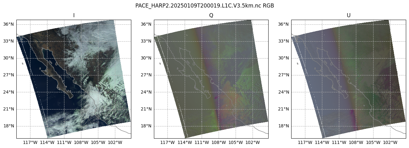
It’s pretty plain to see that the I plot makes sense to the eye: we can see clouds over Mexico and the Southwestern United States, with Baja California mostly cloud-free. The I component of the Stokes vector corresponds to the total intensity. In other words, this is roughly what your eyes would see. However, the Q and U plots don’t quite make as much sense to the eye. We can see that there is some sort of transition in the middle, which is the satellite track. This transition occurs in both plots, but the differences give us a hint: the type of linear polarization we see in the scene depends on the angle with which we view the scene.
This Wikipedia plot is very helpful for understanding what exactly the Q and U components of the Stokes vector mean. Q describes how much the light is oriented in -90°/90° vs. 0°/180°, while U describes how much light is oriented in -135°/45°; vs. -45°/135°.
Next, let’s take a look at the degree of linear polarization (DoLP).
rgb_dolp = dataset["dolp"].isel(
    {
        "number_of_views": [red_nadir_idx, green_nadir_idx, blue_nadir_idx],
    }
)
rgb_dolp = (rgb_dolp - rgb_dolp.min()) / (rgb_dolp.max() - rgb_dolp.min())
crop_rgb_dolp = rgb_dolp.where(
    window.any("bins_along_track") & window.any("bins_across_track"),
    drop=True,
)
crop_rgb = xr.merge((crop_rgb_dolp, crop_rgb_stokes))
Create a figure with 1 row and 2 columns, having a good width for many screens, that will use the projection defined above. For the two columns, we iterate over just the I and DoLP arrays.
fig, ax = plt.subplots(1, 2, figsize=(16, 8), subplot_kw={"projection": crs_proj})
fig.suptitle(f'{prod.attrs["product_name"]} RGB')

for i, (key, value) in enumerate(crop_rgb[["i", "dolp"]].items()):
    ax[i].pcolormesh(value["longitude"], value["latitude"], value, transform=crs_proj)
    ax[i].gridlines(draw_labels={"bottom": "x", "left": "y"}, linestyle="--")
    ax[i].coastlines(color="grey")
    ax[i].set_title(key.upper())
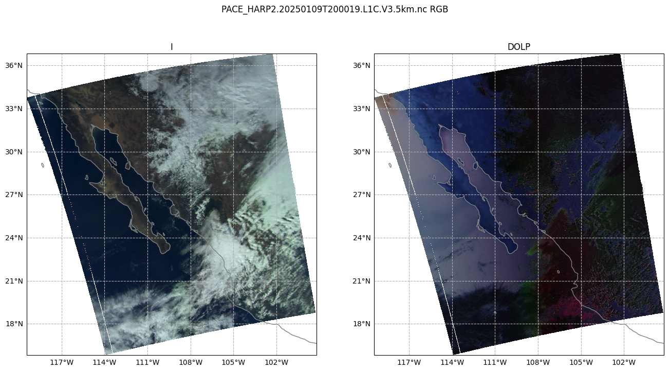
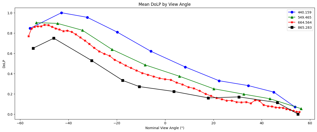
For a different perspective on DoLP, line plots of the channels averaged over the two spatial dimensions show the clear trend associated with view angle. In this scene we see high DoLP in the ocean, which is entirely located in the western half of this granule. Since view angle is strongly correlated with the likelihood that a pixel in this scene is over the ocean, we see a strong relationship between view angle and DoLP in the data.
dolp_mean = dataset["dolp"].mean(["bins_along_track", "bins_across_track"])
dolp_mean = (dolp_mean - dolp_mean.min()) / (dolp_mean.max() - dolp_mean.min())
fig, ax = plt.subplots(figsize=(16, 6))
wv_uq = np.unique(wavelengths.values)
plot_data = [("b", "o"), ("g", "^"), ("r", "*"), ("k", "s")]
for wv_idx in range(4):
    wv = wv_uq[wv_idx]
    wv_mask = wavelengths.values == wv
    c, m = plot_data[wv_idx]
    ax.plot(
        angles.values[wv_mask],
        dolp_mean[wv_mask],
        color=c,
        marker=m,
        markersize=7,
        label=str(wv),
    )
ax.legend()
ax.set_xlabel("Nominal View Angle (°)")
ax.set_ylabel("DoLP")
ax.set_title("Mean DoLP by View Angle")
plt.show()
5. Radiance to Reflectance#
We can convert radiance into reflectance. For a more in-depth explanation, see here. This conversion compensates for the differences in appearance due to the viewing angle and sun angle.
The radiances collected by HARP2 often need to be converted, using additional properties, to reflectances. Write the conversion as a function, because you may need to repeat it.
def rad_to_refl(rad, f0, sza, r):
    """Convert radiance to reflectance.

    :param rad: radiance
    :param f0: solar irradiance
    :param sza: solar zenith angle
    :param r: Sun-Earth distance (in AU)

    :returns: reflectance
    """
    return (r**2) * np.pi * rad / np.cos(sza * np.pi / 180) / f0
The difference in appearance (after matplotlib automatically normalizes the data) is negligible, but the difference in the physical meaning of the array values is quite important.
refl = rad_to_refl(
    rad=dataset["i"],
    f0=view["intensity_f0"],
    sza=dataset["solar_zenith_angle"],
    r=float(dataset.attrs["sun_earth_distance"]),
)
fig, ax = plt.subplots(1, 2, figsize=(16, 8))
ax[0].imshow(dataset["i"].sel({"number_of_views": red_nadir_idx})[::-1], cmap="gray")
ax[0].set_title("Radiance")
ax[1].imshow(refl.sel({"number_of_views": red_nadir_idx})[::-1], cmap="gray")
ax[1].set_title("Reflectance")
plt.show()
print(f"Mean radiance:    {dataset['i'].mean():.1f}")
print(f"Mean reflectance: {refl.mean():.3f}")
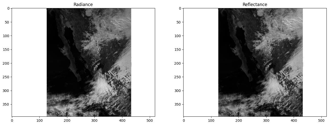
Mean radiance:    121.9
Mean reflectance: 0.377
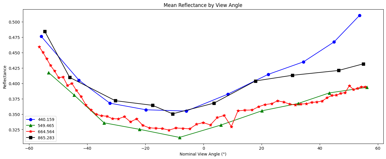
Create a line plot of the mean reflectance for each view angle and spectral channel:
fig, ax = plt.subplots(figsize=(16, 6))
wv_uq = np.unique(wavelengths.values)
plot_data = [("b", "o"), ("g", "^"), ("r", "*"), ("black", "s")]
refl_mean = refl.mean(["bins_along_track", "bins_across_track"])
for wv_idx in range(4):
    wv = wv_uq[wv_idx]
    wv_mask = wavelengths.values == wv
    c, m = plot_data[wv_idx]
    ax.plot(
        angles.values[wv_mask],
        refl_mean[wv_mask],
        color=c,
        marker=m,
        markersize=7,
        label=str(wv),
    )

ax.legend()
ax.set_xlabel("Nominal View Angle (°)")
ax.set_ylabel("Reflectance")
ax.set_title("Mean Reflectance by View Angle")
plt.show()
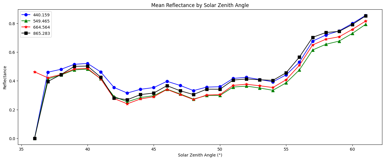
We can also plot the reflectance by solar zenith angle:
sza_idx = (dataset["solar_zenith_angle"] // 1).to_numpy()
sza_uq = np.unique(sza_idx[~np.isnan(sza_idx)]).astype(int)
sza_masks = sza_idx[None] == sza_uq[:, None, None, None]
refl_np = refl.to_numpy()[None]
refl_mean_by_sza = np.nansum(refl_np * sza_masks, axis=(1,2,3)) / sza_masks.sum(axis=(1,2,3))

fig, ax = plt.subplots(figsize=(16, 6))
plot_data = [("b", "o"), ("g", "^"), ("r", "*"), ("black", "s")]
for wv_idx in range(4):
    wv = wv_uq[wv_idx]
    wv_mask = wavelengths.values == wv
    sza_masks_wv = sza_masks[..., wv_mask]
    refl_mean_by_sza = np.nansum(refl_np[..., wv_mask] * sza_masks_wv, axis=(1,2,3)) / np.clip(sza_masks_wv.sum(axis=(1,2,3)), min=1)
    c, m = plot_data[wv_idx]
    ax.plot(
        sza_uq,
        refl_mean_by_sza,
        color=c,
        marker=m,
        markersize=7,
        label=str(wv),
    )
ax.legend()
ax.set_xlabel("Solar Zenith Angle (°)")
ax.set_ylabel("Reflectance")
ax.set_title("Mean Reflectance by Solar Zenith Angle")
plt.show()
6. Animating an Overpass#
WARNING: there is some flickering in the animation displayed in this section.
Multi-angle data innately captures information about 3D structure. To get a sense of that, we’ll make an animation of the scene with the 60 viewing angles available for the red band.
We will generate this animation without using the latitude and longitude coordinates. If you use XArray’s plot as above with coordinates, you could use a projection. However, that can be a little slow for all animation “frames” available with HARP2. This means there will be some stripes of what seems like missing data at certain angles. These stripes actually result from the gridding of the multi-angle data, and are not a bug.
Get the reflectances of just the red channel, and normalize the reflectance to lie between 0 and 1.
refl_red = refl[::-1, :, 10:70]
refl_pretty = (refl_red - refl_red.min()) / (refl_red.max() - refl_red.min())
A very mild Gaussian filter over the angular axis will improve the animation’s smoothness.
refl_pretty.data = gaussian_filter1d(refl_pretty, sigma=0.5, truncate=2, axis=2)
We can apply some simple tone mapping to brighten up the scene for visualization purposes.
refl_pretty = refl_pretty / (refl_pretty + 1.5 * refl_pretty.mean())
Append all but the first and last frame in reverse order, to get a ‘bounce’ effect.
frames = np.arange(refl_pretty.sizes["number_of_views"])
frames = np.concatenate((frames, frames[-1::-1]))
frames
array([ 0,  1,  2,  3,  4,  5,  6,  7,  8,  9, 10, 11, 12, 13, 14, 15, 16,
       17, 18, 19, 20, 21, 22, 23, 24, 25, 26, 27, 28, 29, 30, 31, 32, 33,
       34, 35, 36, 37, 38, 39, 40, 41, 42, 43, 44, 45, 46, 47, 48, 49, 50,
       51, 52, 53, 54, 55, 56, 57, 58, 59, 59, 58, 57, 56, 55, 54, 53, 52,
       51, 50, 49, 48, 47, 46, 45, 44, 43, 42, 41, 40, 39, 38, 37, 36, 35,
       34, 33, 32, 31, 30, 29, 28, 27, 26, 25, 24, 23, 22, 21, 20, 19, 18,
       17, 16, 15, 14, 13, 12, 11, 10,  9,  8,  7,  6,  5,  4,  3,  2,  1,
        0])
In order to display an animation in a Jupyter notebook, the “backend” for matplotlib has to be explicitly set to “widget”.
Now we can use matplotlib.animation to create an initial plot, define a function to update that plot for each new frame, and show the resulting animation. When we create the inital plot, we get back the object called im below. This object is an instance of matplotlib.artist.Artist and is responsible for rendering data on the axes. Our update function uses that artist’s set_data method to leave everything in the plot the same other than the data used to make the image.
fig, ax = plt.subplots()
im = ax.imshow(refl_pretty[{"number_of_views": 0}], cmap="gray")

def update(i):
    im.set_data(refl_pretty[{"number_of_views": i}])
    return im

an = animation.FuncAnimation(fig=fig, func=update, frames=frames, interval=30)
filename = f'harp2_red_anim_{dataset.attrs["product_name"].split(".")[1]}.gif'
an.save(filename, writer="pillow")
plt.close()
You can see some multi-layer clouds in the southwest corner of the granule: notice the parallax effect between these layers.
The sunglint is an obvious feature, but you can also make out the opposition effect on some of the clouds in the scene. These details would be far harder to identify without multiple angles!

Notice the cell ends with plt.close() rather than the usual plt.show(). By default, matplotlib will not display an animation. To view the animation, we saved it as a file and displayed the result in the next cell. Alternatively, you could change the default by executing %matplotlib widget. The widget setting, which works in Jupyter Lab but not on a static website, you can use plt.show() as well as an.pause() and an.resume().
You have completed the notebook giving a first look at HARP2 data. More notebooks are coming soon!