Satellite Data Visualization#
Tutorial Leads: Carina Poulin (NASA, SSAI), Ian Carroll (NASA, UMBC) and Sean Foley (NASA, MSU)
The following notebooks are prerequisites for this tutorial:
Summary#
This is an introductory tutorial to the visualization possibilities arising from PACE data, meant to give you ideas and tools to develop your own scientific data visualizations.
Learning Objectives#
At the end of this notebook you will know:
How to create an easy global map from OCI data from the cloud
How to create a true-color image from OCI data processed with OCSSW
How to make a false color image to look at clouds
How to make an interactive tool to explore OCI data
What goes into an animation of multi-angular HARP2 data
Contents#
1. Setup#
Begin by importing all of the packages used in this notebook. If your kernel uses an environment defined following the guidance on the tutorials page, then the imports will be successful.
import os

from holoviews.streams import Tap
from matplotlib import animation
from matplotlib.colors import ListedColormap
from PIL import Image, ImageEnhance
from scipy.ndimage import gaussian_filter1d
from xarray.backends.api import open_datatree
import cartopy.crs as ccrs
import cmocean
import earthaccess
import holoviews as hv
import matplotlib.pyplot as plt
import matplotlib.pylab as pl
import numpy as np
import panel.widgets as pnw
import xarray as xr
options = xr.set_options(display_expand_attrs=False)
In this tutorial, we suppress runtime warnings that show up when calculating log for negative values, which is common with our datasets.
Define a function to apply enhancements, our own plus generic image enhancements from the Pillow package.
def enhance(rgb, scale = 0.01, vmin = 0.01, vmax = 1.04, gamma=0.95, contrast=1.2, brightness=1.02, sharpness=2, saturation=1.1):
    """The SeaDAS recipe for RGB images from Ocean Color missions.

    Args:
        rgb: a data array with three dimensions, having 3 or 4 bands in the third dimension
        scale: scale value for the log transform
        vmin: minimum pixel value for the image
        vmax: maximum pixel value for the image
        gamma: exponential factor for gamma correction
        contrast: amount of pixel value differentiation
        brightness: pixel values (intensity)
        sharpness: amount of detail
        saturation: color intensity

    Returns:
       a transformed data array better for RGB display
    """
    rgb = rgb.where(rgb > 0)
    rgb = np.log(rgb / scale) / np.log(1 / scale)
    rgb = rgb.where(rgb >= vmin, vmin)
    rgb = rgb.where(rgb <= vmax, vmax)
    rgb_min = rgb.min(("number_of_lines", "pixels_per_line"))
    rgb_max = rgb.max(("number_of_lines", "pixels_per_line"))
    rgb = (rgb - rgb_min) / (rgb_max - rgb_min)
    rgb = rgb * gamma
    img = rgb * 255
    img = img.where(img.notnull(), 0).astype("uint8")
    img = Image.fromarray(img.data)
    enhancer = ImageEnhance.Contrast(img)
    img = enhancer.enhance(contrast)
    enhancer = ImageEnhance.Brightness(img)
    img = enhancer.enhance(brightness)
    enhancer = ImageEnhance.Sharpness(img)
    img = enhancer.enhance(sharpness)
    enhancer = ImageEnhance.Color(img)
    img = enhancer.enhance(saturation)
    rgb[:] = np.array(img) / 255
    return rgb

def enhancel3(rgb, scale = .01, vmin = 0.01, vmax = 1.02, gamma=.95, contrast=1.5, brightness=1.02, sharpness=2, saturation=1.1):

    rgb = rgb.where(rgb > 0)
    rgb = np.log(rgb / scale) / np.log(1 / scale)
    rgb = (rgb -  rgb.min()) / (rgb.max() - rgb.min())
    rgb = rgb * gamma
    img = rgb * 255
    img = img.where(img.notnull(), 0).astype("uint8")
    img = Image.fromarray(img.data)
    enhancer = ImageEnhance.Contrast(img)
    img = enhancer.enhance(contrast)
    enhancer = ImageEnhance.Brightness(img)
    img = enhancer.enhance(brightness)
    enhancer = ImageEnhance.Sharpness(img)
    img = enhancer.enhance(sharpness)
    enhancer = ImageEnhance.Color(img)
    img = enhancer.enhance(saturation)
    rgb[:] = np.array(img) / 255
    return rgb

def pcolormesh(rgb):
    fig = plt.figure()
    axes = plt.subplot()
    artist = axes.pcolormesh(
        rgb["longitude"],
        rgb["latitude"],
        rgb,
        shading="nearest",
        rasterized=True,
    )
    axes.set_aspect("equal")
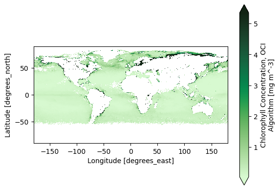
2. Easy Global Chlorophyll-a Map#
Let’s start with the most basic visualization. First, get level-3 chlorophyll map product, which is already gridded on latitudes and longitudes.
results = earthaccess.search_data(
    short_name="PACE_OCI_L3M_CHL_NRT",
    granule_name="*.MO.*.0p1deg.*",
)
paths = earthaccess.open(results)
dataset = xr.open_dataset(paths[-1])
chla = dataset["chlor_a"]
Now we can already create a global map. Let’s use a special colormap from cmocean to be fancy, but this is not necessary to make a basic map. Use the robust="true" option to remove outliers.
artist = chla.plot(cmap=cmocean.cm.algae, robust="true")
plt.gca().set_aspect("equal")
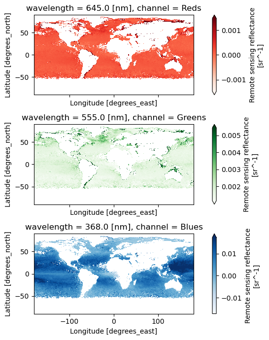
3. Global Oceans in Quasi True Color#
True color images use three bands to create a RGB image. Let’s still use a level-3 mapped product, this time we use the remote-sensing reflectance (Rrs) product.
results = earthaccess.search_data(
    short_name="PACE_OCI_L3M_RRS_NRT",
    granule_name="*.MO.*.0p1deg.*",
)
paths = earthaccess.open(results)
The Level-3 Mapped files have no groups and have variables that XArray recognizes as “coordinates”: variables that are named after their only dimension.
dataset = xr.open_dataset(paths[-1])
Look at all the wavelentghs available!
dataset["wavelength"].data
array([339., 341., 344., 346., 348., 351., 353., 356., 358., 361., 363.,
       366., 368., 371., 373., 375., 378., 380., 383., 385., 388., 390.,
       393., 395., 398., 400., 403., 405., 408., 410., 413., 415., 418.,
       420., 422., 425., 427., 430., 432., 435., 437., 440., 442., 445.,
       447., 450., 452., 455., 457., 460., 462., 465., 467., 470., 472.,
       475., 477., 480., 482., 485., 487., 490., 492., 495., 497., 500.,
       502., 505., 507., 510., 512., 515., 517., 520., 522., 525., 527.,
       530., 532., 535., 537., 540., 542., 545., 547., 550., 553., 555.,
       558., 560., 563., 565., 568., 570., 573., 575., 578., 580., 583.,
       586., 588., 591., 593., 596., 598., 601., 603., 605., 608., 610.,
       613., 615., 618., 620., 623., 625., 627., 630., 632., 635., 637.,
       640., 641., 642., 643., 645., 646., 647., 648., 650., 651., 652.,
       653., 655., 656., 657., 658., 660., 661., 662., 663., 665., 666.,
       667., 668., 670., 671., 672., 673., 675., 676., 677., 678., 679.,
       681., 682., 683., 684., 686., 687., 688., 689., 691., 692., 693.,
       694., 696., 697., 698., 699., 701., 702., 703., 704., 706., 707.,
       708., 709., 711., 712., 713., 714., 717., 719.])
For a true color image, choose three wavelengths to represent the “Red”, “Green”, and “Blue” channels used to make true color images.
rrs_rgb = dataset["Rrs"].sel({"wavelength": [645, 555, 368]})
rrs_rgb
<xarray.DataArray 'Rrs' (lat: 1800, lon: 3600, wavelength: 3)> Size: 78MB
[19440000 values with dtype=float32]
Coordinates:
  * wavelength  (wavelength) float64 24B 645.0 555.0 368.0
  * lat         (lat) float32 7kB 89.95 89.85 89.75 ... -89.75 -89.85 -89.95
  * lon         (lon) float32 14kB -179.9 -179.9 -179.8 ... 179.8 179.9 180.0
Attributes: (8)
It is always a good practice to build meaningful labels into the dataset, and we’ll see next that it can be very useful as we learn to use metadata while creating visualizations.
For this case, we can attach another variable called “channel” and then swap it with
“wavelength” to become the third dimension of the data array. We’ll actually use these
values for a choice of cmap below, just for fun.
rrs_rgb["channel"] = ("wavelength", ["Reds", "Greens", "Blues"])
rrs_rgb = rrs_rgb.swap_dims({"wavelength": "channel"})
rrs_rgb
<xarray.DataArray 'Rrs' (lat: 1800, lon: 3600, channel: 3)> Size: 78MB
[19440000 values with dtype=float32]
Coordinates:
    wavelength  (channel) float64 24B 645.0 555.0 368.0
  * lat         (lat) float32 7kB 89.95 89.85 89.75 ... -89.75 -89.85 -89.95
  * lon         (lon) float32 14kB -179.9 -179.9 -179.8 ... 179.8 179.9 180.0
  * channel     (channel) <U6 72B 'Reds' 'Greens' 'Blues'
Attributes: (8)A complicated figure can be assembled fairly easily using the xarray.Dataset.plot method,
which draws on the matplotlib package. For Level-3 data, we can specifically use imshow
to visualize the RGB image on the lat and lon coordinates.
fig, axs = plt.subplots(3, 1, figsize=(8, 7), sharex=True)
for i, item in enumerate(rrs_rgb["channel"]):
    array = rrs_rgb.sel({"channel": item})
    array.plot.imshow(x="lon", y="lat", cmap=item.item(), ax=axs[i], robust=True)
    axs[i].set_aspect("equal")
fig.tight_layout()
plt.show()
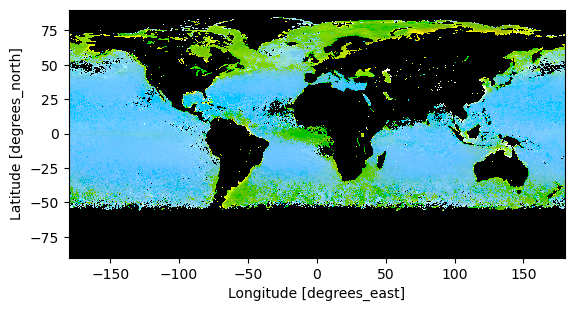
We use the enhancel3 function defined at the start of the tutorial to make adjusments to the image.
rrs_rgb_enhanced = enhancel3(rrs_rgb)
And we create the image using the imshow function.
artist = rrs_rgb_enhanced.plot.imshow(x="lon", y="lat")
plt.gca().set_aspect("equal")
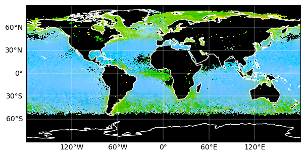
Finally, we can add a grid and coastlines to the map with cartopy tools.
fig = plt.figure(figsize=(7, 5))
ax = plt.axes(projection=ccrs.PlateCarree())
artist = rrs_rgb_enhanced.plot.imshow(x="lon", y="lat")
ax.gridlines(draw_labels={"left": "y", "bottom": "x"}, color="white", linewidth=0.3)
ax.coastlines(color="white", linewidth=1)
plt.show()
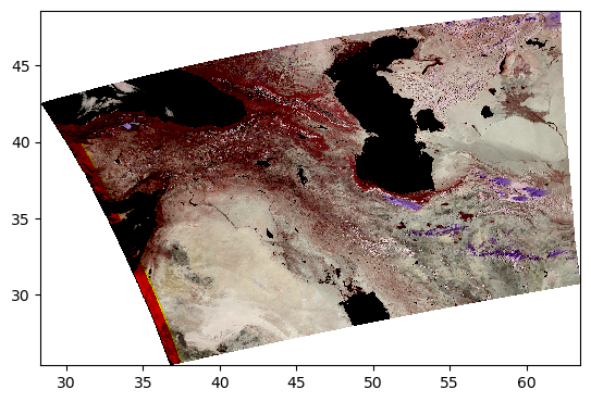
4. Complete Scene in True Color#
The best product to create a high-quality true-color image from PACE is the Surface Reflectance (rhos). Cloud-masked rhos are distributed in the SFREFL product suite. If you want to create an image that includes clouds, however, you need to process a Level-1B file to Level-2 using l2gen, like we will show in the OCSSW data processing exercise.
All files created by a PACE Hackweek tutorial can be found in the /shared/pace-hackweek-2024/ folder accessible from the JupyterLab file browser. In this tutorial, we’ll use a Level-2 file created in advance. Note that the JupyterLab file browser treats /home/jovyan (that’s your home directory, Jovyan) as the root of the browsable file system.
path = "/home/jovyan/shared/pace-hackweek-2024/PACE_OCI.20240605T092137.L2_SFREFL.V2.nc"
datatree = open_datatree(path)
dataset = xr.merge(datatree.to_dict().values())
dataset
<xarray.Dataset> Size: 461MB
Dimensions:        (number_of_bands: 286, number_of_reflective_bands: 286,
                    wavelength_3d: 50, number_of_lines: 1710,
                    pixels_per_line: 1272)
Coordinates:
  * wavelength_3d  (wavelength_3d) float64 400B 339.0 353.0 ... 2.258e+03
Dimensions without coordinates: number_of_bands, number_of_reflective_bands,
                                number_of_lines, pixels_per_line
Data variables: (12/26)
    wavelength     (number_of_bands) float64 2kB ...
    vcal_gain      (number_of_reflective_bands) float32 1kB ...
    vcal_offset    (number_of_reflective_bands) float32 1kB ...
    F0             (number_of_reflective_bands) float32 1kB ...
    aw             (number_of_reflective_bands) float32 1kB ...
    bbw            (number_of_reflective_bands) float32 1kB ...
    ...             ...
    csol_z         (number_of_lines) float32 7kB ...
    rhos           (number_of_lines, pixels_per_line, wavelength_3d) float32 435MB ...
    l2_flags       (number_of_lines, pixels_per_line) int32 9MB ...
    longitude      (number_of_lines, pixels_per_line) float32 9MB ...
    latitude       (number_of_lines, pixels_per_line) float32 9MB ...
    tilt           (number_of_lines) float32 7kB ...
Attributes: (43)The longitude and latitude variables are geolocation arrays, and while they are spatial coordinates they cannot be set as an index on the dataset because each array is itself two-dimensional. The rhos are not on a rectangular grid, but it is still useful to tell XArray what will become axis labels.
dataset = dataset.set_coords(("longitude", "latitude"))
dataset
<xarray.Dataset> Size: 461MB
Dimensions:        (number_of_bands: 286, number_of_reflective_bands: 286,
                    wavelength_3d: 50, number_of_lines: 1710,
                    pixels_per_line: 1272)
Coordinates:
  * wavelength_3d  (wavelength_3d) float64 400B 339.0 353.0 ... 2.258e+03
    longitude      (number_of_lines, pixels_per_line) float32 9MB ...
    latitude       (number_of_lines, pixels_per_line) float32 9MB ...
Dimensions without coordinates: number_of_bands, number_of_reflective_bands,
                                number_of_lines, pixels_per_line
Data variables: (12/24)
    wavelength     (number_of_bands) float64 2kB ...
    vcal_gain      (number_of_reflective_bands) float32 1kB ...
    vcal_offset    (number_of_reflective_bands) float32 1kB ...
    F0             (number_of_reflective_bands) float32 1kB ...
    aw             (number_of_reflective_bands) float32 1kB ...
    bbw            (number_of_reflective_bands) float32 1kB ...
    ...             ...
    clat           (number_of_lines) float32 7kB ...
    elat           (number_of_lines) float32 7kB ...
    csol_z         (number_of_lines) float32 7kB ...
    rhos           (number_of_lines, pixels_per_line, wavelength_3d) float32 435MB ...
    l2_flags       (number_of_lines, pixels_per_line) int32 9MB ...
    tilt           (number_of_lines) float32 7kB ...
Attributes: (43)We then select the three wavelenghts that will become the red, green and blue chanels in our image.
rhos_rgb = dataset["rhos"].sel({"wavelength_3d": [645, 555, 368]})
rhos_rgb
<xarray.DataArray 'rhos' (number_of_lines: 1710, pixels_per_line: 1272,
                          wavelength_3d: 3)> Size: 26MB
[6525360 values with dtype=float32]
Coordinates:
  * wavelength_3d  (wavelength_3d) float64 24B 645.0 555.0 368.0
    longitude      (number_of_lines, pixels_per_line) float32 9MB ...
    latitude       (number_of_lines, pixels_per_line) float32 9MB ...
Dimensions without coordinates: number_of_lines, pixels_per_line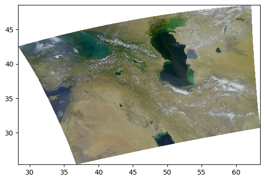
Attributes: (3)We are ready to have a look at our image. The most simple adjustment is normalization of the range across the three RGB channels.
rhos_rgb_max = rhos_rgb.max()
rhos_rgb_min = rhos_rgb.min()
rhos_rgb_enhanced = (rhos_rgb - rhos_rgb_min) / (rhos_rgb_max - rhos_rgb_min)
To visualize these data, we have to use the fairly smart pcolormesh artists, which interprets
the geolocation arrays as pixel centers. TODO: why the warning, though?
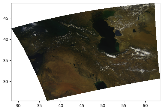
pcolormesh(rhos_rgb_enhanced)
/tmp/ipykernel_246/1825938188.py:63: UserWarning: The input coordinates to pcolormesh are interpreted as cell centers, but are not monotonically increasing or decreasing. This may lead to incorrectly calculated cell edges, in which case, please supply explicit cell edges to pcolormesh.
  artist = axes.pcolormesh(
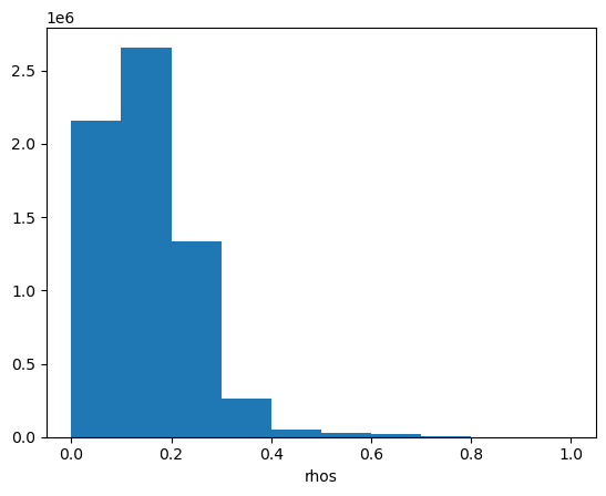
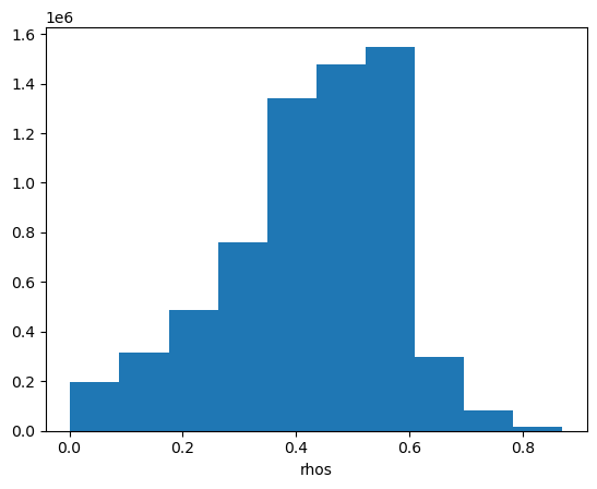
Let’s have a look at the image’s histogram that shows the pixel intensity value distribution across the image. Here, we can see that the values are skewed towards the low intensities, which makes the image dark.
rhos_rgb_enhanced.plot.hist()
(array([2.157640e+06, 2.657788e+06, 1.336647e+06, 2.589910e+05,
        5.398700e+04, 3.042900e+04, 1.919300e+04, 9.072000e+03,
        1.552000e+03, 6.100000e+01]),
 array([0.        , 0.1       , 0.2       , 0.30000001, 0.40000001,
        0.5       , 0.60000002, 0.69999999, 0.80000001, 0.89999998,
        1.        ]),
 <BarContainer object of 10 artists>)
Another type of enhancement involves a logarithmic transform of the data before normalizing to the unit range.
rhos_rgb_enhanced = rhos_rgb.where(rhos_rgb > 0, np.nan)
rhos_rgb_enhanced = np.log(rhos_rgb_enhanced / 0.01) / np.log(1 / 0.01)
rhos_rgb_max = rhos_rgb_enhanced.max()
rhos_rgb_min = rhos_rgb_enhanced.min()
rhos_rgb_enhanced = (rhos_rgb_enhanced - rhos_rgb_min) / (rhos_rgb_max - rhos_rgb_min)
pcolormesh(rhos_rgb_enhanced)
/tmp/ipykernel_246/1825938188.py:63: UserWarning: The input coordinates to pcolormesh are interpreted as cell centers, but are not monotonically increasing or decreasing. This may lead to incorrectly calculated cell edges, in which case, please supply explicit cell edges to pcolormesh.
  artist = axes.pcolormesh(
Perhaps it is better to do the unit normalization independently for each channel? We can use XArray’s ability to use and align labelled dimensions for the calculation.
rhos_rgb_max = rhos_rgb.max(("number_of_lines", "pixels_per_line"))
rhos_rgb_min = rhos_rgb.min(("number_of_lines", "pixels_per_line"))
rhos_rgb_enhanced = (rhos_rgb - rhos_rgb_min) / (rhos_rgb_max - rhos_rgb_min)
pcolormesh(rhos_rgb_enhanced)
/tmp/ipykernel_246/1825938188.py:63: UserWarning: The input coordinates to pcolormesh are interpreted as cell centers, but are not monotonically increasing or decreasing. This may lead to incorrectly calculated cell edges, in which case, please supply explicit cell edges to pcolormesh.
  artist = axes.pcolormesh(
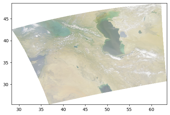
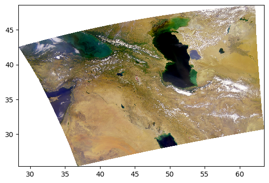
Let’s go back to the log-transformed image, but this time adjust the minimum and maximum pixel values vmin and vmax.
rhos_rgb_enhanced = rhos_rgb.where(rhos_rgb > 0, np.nan)
rhos_rgb_enhanced = np.log(rhos_rgb_enhanced / 0.01) / np.log(1 / 0.01)
vmin = 0.01
vmax = 1.04

rhos_rgb_enhanced = rhos_rgb_enhanced.where(rhos_rgb_enhanced <= vmax, vmax)
rhos_rgb_enhanced = rhos_rgb_enhanced.where(rhos_rgb_enhanced >= vmin, vmin)
rhos_rgb_max = rhos_rgb.max(("number_of_lines", "pixels_per_line"))
rhos_rgb_min = rhos_rgb.min(("number_of_lines", "pixels_per_line"))
rhos_rgb_enhanced = (rhos_rgb_enhanced - rhos_rgb_min) / (rhos_rgb_max - rhos_rgb_min)
pcolormesh(rhos_rgb_enhanced)
/tmp/ipykernel_246/1825938188.py:63: UserWarning: The input coordinates to pcolormesh are interpreted as cell centers, but are not monotonically increasing or decreasing. This may lead to incorrectly calculated cell edges, in which case, please supply explicit cell edges to pcolormesh.
  artist = axes.pcolormesh(
This image looks much more balanced. The histogram is also going to indicate this:
rhos_rgb_enhanced.plot.hist()
(array([ 198314.,  316128.,  487929.,  761272., 1342204., 1477057.,
        1548933.,  297209.,   80733.,   15581.]),
 array([0.00167709, 0.08844238, 0.17520766, 0.26197293, 0.34873822,
        0.43550351, 0.52226877, 0.60903406, 0.69579935, 0.78256464,
        0.86932993]),
 <BarContainer object of 10 artists>)
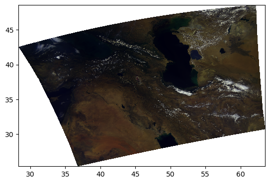
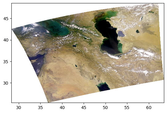
Everything we’ve been trying is already built into the enhance function, including extra goodies from the Pillow package of generic image processing filters.
rhos_rgb_enhanced = enhance(rhos_rgb)
pcolormesh(rhos_rgb_enhanced)
/tmp/ipykernel_246/1825938188.py:63: UserWarning: The input coordinates to pcolormesh are interpreted as cell centers, but are not monotonically increasing or decreasing. This may lead to incorrectly calculated cell edges, in which case, please supply explicit cell edges to pcolormesh.
  artist = axes.pcolormesh(
Since every image is unique, we can further adjust the parameters.
rhos_rgb_enhanced = enhance(rhos_rgb, contrast=1.2, brightness=1.1, saturation=0.8)
pcolormesh(rhos_rgb_enhanced)
/tmp/ipykernel_246/1825938188.py:63: UserWarning: The input coordinates to pcolormesh are interpreted as cell centers, but are not monotonically increasing or decreasing. This may lead to incorrectly calculated cell edges, in which case, please supply explicit cell edges to pcolormesh.
  artist = axes.pcolormesh(
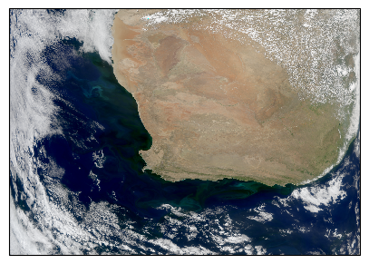
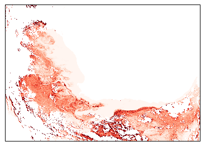
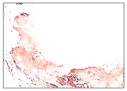
5. False Color for Ice Clouds#
We can use the same RGB image method, this time with different bands, to create false-color images that highlight specific elements in an image.
For example, using a combination of infrared bands can highlight ice clouds in the atmosphere, versus regular water vapor clouds. Let’s try it:
rhos_ice = dataset["rhos"].sel({"wavelength_3d": [1618, 2131, 2258]})
rhos_ice_enhanced = enhance(rhos_ice, vmin=0, vmax=0.9, scale=.1, gamma =1, contrast=1, brightness=1, saturation=1)
pcolormesh(rhos_ice_enhanced)
/tmp/ipykernel_246/1825938188.py:63: UserWarning: The input coordinates to pcolormesh are interpreted as cell centers, but are not monotonically increasing or decreasing. This may lead to incorrectly calculated cell edges, in which case, please supply explicit cell edges to pcolormesh.
  artist = axes.pcolormesh(
Here, the ice clouds are purple and water vapor clouds are white, like we can see in the northwestern region of the scene.
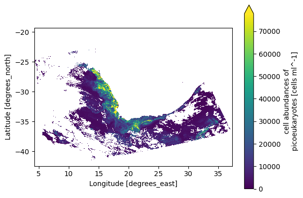
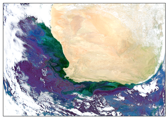
6. Phytoplankton in False Color#
A uniquely innovative type of product from PACE is the phytoplankton community composition, using the MOANA algorithm. It gives the abundance of three types of plankton: picoeucaryotes, prochlorococcus and synechococcus. These products were used to create the first light image for PACE. Let’s see how.
We first open the dataset that is created with l2gen. This will be covered in the OCSSW tutorial.
path = "/home/jovyan/shared/pace-hackweek-2024/PACE_OCI.20240309T115927.L2_MOANA.V2.nc"

datatree = open_datatree(path)
dataset = xr.merge(datatree.to_dict().values())
dataset
<xarray.Dataset> Size: 96MB
Dimensions:          (number_of_bands: 286, number_of_reflective_bands: 286,
                      number_of_lines: 1710, pixels_per_line: 1272)
Dimensions without coordinates: number_of_bands, number_of_reflective_bands,
                                number_of_lines, pixels_per_line
Data variables: (12/33)
    wavelength       (number_of_bands) float64 2kB ...
    vcal_gain        (number_of_reflective_bands) float32 1kB ...
    vcal_offset      (number_of_reflective_bands) float32 1kB ...
    F0               (number_of_reflective_bands) float32 1kB ...
    aw               (number_of_reflective_bands) float32 1kB ...
    bbw              (number_of_reflective_bands) float32 1kB ...
    ...               ...
    rhos_645         (number_of_lines, pixels_per_line) float32 9MB ...
    poc              (number_of_lines, pixels_per_line) float32 9MB ...
    l2_flags         (number_of_lines, pixels_per_line) int32 9MB ...
    longitude        (number_of_lines, pixels_per_line) float32 9MB ...
    latitude         (number_of_lines, pixels_per_line) float32 9MB ...
    tilt             (number_of_lines) float32 7kB ...
Attributes: (43)We can see the MOANA products, RGB bands and other level-2 products in the dataset. We still need to set the spatial variables as coordinates of the dataset.
dataset = dataset.set_coords(("longitude", "latitude"))
Let’s make a quick MOANA product plot to see if everything looks normal.
artist = dataset["picoeuk_moana"].plot(x="longitude", y="latitude", cmap="viridis", vmin=0, robust="true")
plt.gca().set_aspect("equal")
Now we create a RGB image using our three rhos bands and the usual log-transform, vmin/vmax adjustments and normalization. We also project the map using cartopy.
# OCI True Color 1 band -min/max adjusted
vmin = 0.01
vmax = 1.04 # Above 1 because whites can be higher than 1
#----

rhos_red = dataset["rhos_645"]
rhos_green = dataset["rhos_555"]
rhos_blue = dataset["rhos_465"]
red = np.log(rhos_red/0.01)/np.log(1/0.01)
green = np.log(rhos_green/0.01)/np.log(1/0.01)
blue = np.log(rhos_blue/0.01)/np.log(1/0.01)
red = red.where((red >= vmin) & (red <= vmax), vmin, vmax)
green = green.where((green >= vmin) & (green <= vmax), vmin, vmax)
blue = blue.where((blue >= vmin) & (blue <= vmax), vmin, vmax)
rgb = np.dstack((red, green, blue))
rgb = (rgb -  np.nanmin(rgb)) / (np.nanmax(rgb) - np.nanmin(rgb)) #normalize

fig = plt.figure(figsize=(5, 5))
axes = fig.add_subplot(projection=ccrs.PlateCarree())
artist = axes.imshow(
    rgb,
    extent=(dataset.longitude.min(), dataset.longitude.max(), dataset.latitude.min(), dataset.latitude.max()),
    origin='lower',
    transform=ccrs.PlateCarree(),
    interpolation='none',
)
We then enhance the image.
# Image adjustments: change values from 0 to 2, 1 being unchanged
contrast = 1.72
brightness = 1
sharpness = 2
saturation = 1.3
gamma = .43
#----

normalized_image = (rgb - rgb.min()) / (rgb.max() - rgb.min())
normalized_image = normalized_image** gamma
normalized_image = (normalized_image* 255).astype(np.uint8)
image_pil = Image.fromarray(normalized_image)
enhancer = ImageEnhance.Contrast(image_pil)
image_enhanced = enhancer.enhance(contrast)
enhancer = ImageEnhance.Brightness(image_enhanced)
image_enhanced = enhancer.enhance(brightness)
enhancer = ImageEnhance.Sharpness(image_enhanced)
image_enhanced = enhancer.enhance(sharpness)
enhancer = ImageEnhance.Color(image_enhanced)
image_enhanced = enhancer.enhance(saturation)
enhanced_image_np = np.array(image_enhanced) / 255.0  # Normalize back to [0, 1] range

fig = plt.figure(figsize=(5, 5))
axes = plt.subplot(projection=ccrs.PlateCarree())
extent=(dataset.longitude.min(), dataset.longitude.max(), dataset.latitude.min(), dataset.latitude.max())
artist = axes.imshow(enhanced_image_np, extent=extent, origin='lower', transform=ccrs.PlateCarree(), alpha=1)
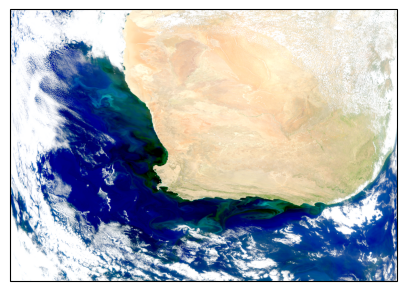
We then project the MOANA products on the same grid. We can look at Synechococcus as an example.
fig = plt.figure(figsize=(5, 5))
axes = fig.add_subplot(projection=ccrs.PlateCarree())
extent=(dataset.longitude.min(), dataset.longitude.max(), dataset.latitude.min(), dataset.latitude.max())
artist = axes.imshow(dataset["syncoccus_moana"], extent=extent, origin='lower', transform=ccrs.PlateCarree(), interpolation='none', cmap="Reds", vmin=0, vmax=35000, alpha = 1)
To layer the three products on our true-color image, we will add transparency to our colormaps for the three plankton products. Look at the Synechococcus product again.
cmap_greens = pl.cm.Greens # Get original color map
my_cmap_greens = cmap_greens(np.arange(cmap_greens.N))
my_cmap_greens[:,-1] = np.linspace(0, 1, cmap_greens.N) # Set alpha for transparency
my_cmap_greens = ListedColormap(my_cmap_greens) # Create new colormap
cmap_reds = pl.cm.Reds
my_cmap_reds = cmap_reds(np.arange(cmap_reds.N))
my_cmap_reds[:,-1] = np.linspace(0, 1, cmap_reds.N)
my_cmap_reds = ListedColormap(my_cmap_reds)
cmap_blues = pl.cm.Blues
my_cmap_blues = cmap_blues(np.arange(cmap_blues.N))
my_cmap_blues[:,-1] = np.linspace(0, 1, cmap_blues.N)
my_cmap_blues = ListedColormap(my_cmap_blues)

fig = plt.figure(figsize=(5, 5))
axes = fig.add_subplot(projection=ccrs.PlateCarree())
extent=(dataset.longitude.min(), dataset.longitude.max(), dataset.latitude.min(), dataset.latitude.max())
artist = axes.imshow(dataset["syncoccus_moana"], extent=extent, origin='lower', transform=ccrs.PlateCarree(), interpolation='none', cmap=my_cmap_reds, vmin=0, vmax=35000, alpha = 1)
We finally assemble the image using the plankton layers and the true-color base layer.
fig = plt.figure(figsize=(7, 7))
axes = plt.subplot(projection=ccrs.PlateCarree())
extent=(dataset.longitude.min(), dataset.longitude.max(), dataset.latitude.min(), dataset.latitude.max())
axes.imshow(enhanced_image_np, extent=extent, origin='lower', transform=ccrs.PlateCarree(), alpha=1)
axes.imshow(dataset["prococcus_moana"], extent=extent, origin='lower', transform=ccrs.PlateCarree(), interpolation='none', cmap=my_cmap_blues, vmin=0, vmax=300000, alpha = .5)
axes.imshow(dataset["syncoccus_moana"], extent=extent, origin='lower', transform=ccrs.PlateCarree(), interpolation='none', cmap=my_cmap_reds, vmin=0, vmax=20000, alpha = .5)
axes.imshow(dataset["picoeuk_moana"], extent=extent, origin='lower', transform=ccrs.PlateCarree(), interpolation='none', cmap=my_cmap_greens, vmin=0, vmax=50000, alpha = .5)
plt.show()
7. Full Spectra from Global Oceans#
This section contains interactive plots that require a live Python kernel. Not all the widgets will work when viewing the notebook; the cells have to be executed and the kernel still running. Download the notebook and give it a try!
The holoview library and its bokeh extension allow us to explore datasets interactively.
hv.extension("bokeh")


Let’s open a level 3 Rrs map.
results = earthaccess.search_data(
    short_name="PACE_OCI_L3M_RRS_NRT",
    granule_name="*.MO.*.1deg.*",
)
paths = earthaccess.open(results)
We can create a map from a single band in the dataset and see the Rrs value by hovering over the map.
dataset = xr.open_dataset(paths[-1])
def single_band(w):
    array = dataset.sel({"wavelength": w})
    return hv.Image(array, kdims=["lon", "lat"], vdims=["Rrs"]).opts(aspect="equal", frame_width=450, frame_height=250, tools=['hover'])
single_band(368)
In order to explore the hyperspectral datasets from PACE, we can have a look at the Rrs Spectrum at a certain location.
def spectrum(x, y):
    array = dataset.sel({"lon": x, "lat": y}, method="nearest")
    return hv.Curve(array, kdims=["wavelength"]).redim.range(Rrs=(-0.01, 0.04))
spectrum(0, 0)
Now we can build a truly interactive map with a slider to change the mapped band and a capability to show the spectrum where we click on the map. First, we build the slider and its interactivity with the map:
slider = pnw.DiscreteSlider(name="wavelength", options=list(dataset["wavelength"].data))
band_dmap = hv.DynamicMap(single_band, streams={"w": slider.param.value})
Then we build the capability to show the Rrs spectrum at the point where we click on the map.
points = hv.Points([])
tap = Tap(source=points, x=0, y=0)
spectrum_dmap = hv.DynamicMap(spectrum, streams=[tap])
Now try it!
slider
(band_dmap * points + spectrum_dmap).opts(shared_axes=False)
8. Animation from Multiple Angles#
Let’s look at the multi-angular datasets from HARP2. First, download some HARP2 Level-1C data using the short_name value “PACE_HARP2_L1C_SCI” in earthaccess.search_data. Level-1C corresponds to geolocated imagery. This means the imagery coming from the satellite has been calibrated and assigned to locations on the Earth’s surface.
tspan = ("2024-05-20", "2024-05-20")
results = earthaccess.search_data(
    short_name="PACE_HARP2_L1C_SCI",
    temporal=tspan,
    count=1,
)
paths = earthaccess.open(results)
prod = xr.open_dataset(paths[0])
view = xr.open_dataset(paths[0], group="sensor_views_bands").squeeze()
geo = xr.open_dataset(paths[0], group="geolocation_data").set_coords(["longitude", "latitude"])
obs = xr.open_dataset(paths[0], group="observation_data").squeeze()
The prod dataset, as usual for OB.DAAC products, contains attributes but no variables. Merge it with the “observation_data” and “geolocation_data”, setting latitude and longitude as auxiliary (e.e. non-index) coordinates, to get started.
dataset = xr.merge((prod, obs, geo))
dataset
<xarray.Dataset> Size: 1GB
Dimensions:                 (bins_along_track: 396, bins_across_track: 519,
                             number_of_views: 90)
Coordinates:
    longitude               (bins_along_track, bins_across_track) float32 822kB ...
    latitude                (bins_along_track, bins_across_track) float32 822kB ...
Dimensions without coordinates: bins_along_track, bins_across_track,
                                number_of_views
Data variables: (12/20)
    number_of_observations  (bins_along_track, bins_across_track, number_of_views) float32 74MB ...
    qc                      (bins_along_track, bins_across_track, number_of_views) float32 74MB ...
    i                       (bins_along_track, bins_across_track, number_of_views) float32 74MB ...
    q                       (bins_along_track, bins_across_track, number_of_views) float32 74MB ...
    u                       (bins_along_track, bins_across_track, number_of_views) float32 74MB ...
    dolp                    (bins_along_track, bins_across_track, number_of_views) float32 74MB ...
    ...                      ...
    sensor_zenith_angle     (bins_along_track, bins_across_track, number_of_views) float32 74MB ...
    sensor_azimuth_angle    (bins_along_track, bins_across_track, number_of_views) float32 74MB ...
    solar_zenith_angle      (bins_along_track, bins_across_track, number_of_views) float32 74MB ...
    solar_azimuth_angle     (bins_along_track, bins_across_track, number_of_views) float32 74MB ...
    scattering_angle        (bins_along_track, bins_across_track, number_of_views) float32 74MB ...
    rotation_angle          (bins_along_track, bins_across_track, number_of_views) float32 74MB ...
Attributes: (81)Understanding Multi-Angle Data#
HARP2 is a multi-spectral sensor, like OCI, with 4 spectral bands. These roughly correspond to green, red, near infrared (NIR), and blue (in that order). HARP2 is also multi-angle. These angles are with respect to the satellite track. Essentially, HARP2 is always looking ahead, looking behind, and everywhere in between. The number of angles varies per sensor. The red band has 60 angles, while the green, blue, and NIR bands each have 10.
In the HARP2 data, the angles and the spectral bands are combined into one axis. I’ll refer to this combined axis as HARP2’s “channels.” Below, we’ll make a quick plot both the viewing angles and the wavelengths of HARP2’s channels. In both plots, the x-axis is simply the channel index.
Pull out the view angles and wavelengths.
angles = view["sensor_view_angle"]
wavelengths = view["intensity_wavelength"]
Radiance to Reflectance#
We can convert radiance into reflectance. For a more in-depth explanation, see here. This conversion compensates for the differences in appearance due to the viewing angle and sun angle. Write the conversion as a function, because you may need to repeat it.
def rad_to_refl(rad, f0, sza, r):
    """Convert radiance to reflectance.

    Args:
        rad: Radiance.
        f0: Solar irradiance.
        sza: Solar zenith angle.
        r: Sun-Earth distance (in AU).

    Returns: Reflectance.
    """
    return (r**2) * np.pi * rad / np.cos(sza * np.pi / 180) / f0
The difference in appearance (after matplotlib automatically normalizes the data) is negligible, but the difference in the physical meaning of the array values is quite important.
refl = rad_to_refl(
    rad=dataset["i"],
    f0=view["intensity_f0"],
    sza=dataset["solar_zenith_angle"],
    r=float(dataset.attrs["sun_earth_distance"]),
)
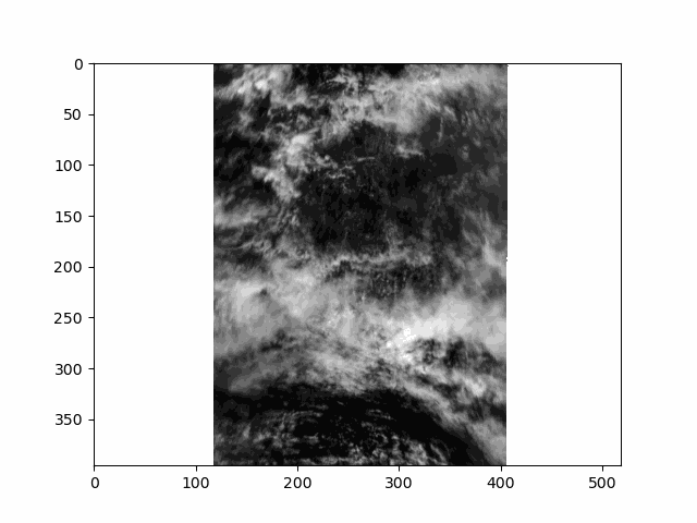
Animating an Overpass#
WARNING: there is some flickering in the animation displayed in this section.
All that is great for looking at a single angle at a time, but it doesn’t capture the multi-angle nature of the instrument. Multi-angle data innately captures information about 3D structure. To get a sense of that, we’ll make an animation of the scene with the 60 viewing angles available for the red band.
We are going to generate this animation without using the latitude and longitude coordinates. If you use XArray’s plot as above with coordinates, you could use a projection. However, that can be a little slow for all animation “frames” available with HARP2. This means there will be some stripes of what seems like missing data at certain angles. These stripes actually result from the gridding of the multi-angle data, and are not a bug.
Get the reflectances of just the red channel, and normalize the reflectance to lie between 0 and 1.
refl_red = refl[..., 10:70]
refl_pretty = (refl_red - refl_red.min()) / (refl_red.max() - refl_red.min())
A very mild Gaussian filter over the angular axis will improve the animation’s smoothness.
refl_pretty.data = gaussian_filter1d(refl_pretty, sigma=0.5, truncate=2, axis=2)
Raising the image to the power 2/3 will brighten it a little bit.
refl_pretty = refl_pretty ** (2 / 3)
Append all but the first and last frame in reverse order, to get a ‘bounce’ effect.
frames = np.arange(refl_pretty.sizes["number_of_views"])
frames = np.concatenate((frames, frames[-1::-1]))
frames
array([ 0,  1,  2,  3,  4,  5,  6,  7,  8,  9, 10, 11, 12, 13, 14, 15, 16,
       17, 18, 19, 20, 21, 22, 23, 24, 25, 26, 27, 28, 29, 30, 31, 32, 33,
       34, 35, 36, 37, 38, 39, 40, 41, 42, 43, 44, 45, 46, 47, 48, 49, 50,
       51, 52, 53, 54, 55, 56, 57, 58, 59, 59, 58, 57, 56, 55, 54, 53, 52,
       51, 50, 49, 48, 47, 46, 45, 44, 43, 42, 41, 40, 39, 38, 37, 36, 35,
       34, 33, 32, 31, 30, 29, 28, 27, 26, 25, 24, 23, 22, 21, 20, 19, 18,
       17, 16, 15, 14, 13, 12, 11, 10,  9,  8,  7,  6,  5,  4,  3,  2,  1,
        0])
In order to display an animation in a Jupyter notebook, the “backend” for matplotlib has to be explicitly set to “widget”.
Now we can use matplotlib.animation to create an initial plot, define a function to update that plot for each new frame, and show the resulting animation. When we create the inital plot, we get back the object called im below. This object is an instance of matplotlib.artist.Artist and is responsible for rendering data on the axes. Our update function uses that artist’s set_data method to leave everything in the plot the same other than the data used to make the image.
fig, ax = plt.subplots()
im = ax.imshow(refl_pretty[{"number_of_views": 0}], cmap="gray")

def update(i):
    im.set_data(refl_pretty[{"number_of_views": i}])
    return im

an = animation.FuncAnimation(fig=fig, func=update, frames=frames, interval=30)
filename = f'harp2_red_anim_{dataset.attrs["product_name"].split(".")[1]}.gif'
an.save(filename, writer="pillow")
plt.close()
This scene is a great example of multi-layer clouds. You can use the parallax effect to distinguish between these layers.
The sunglint is an obvious feature, but you can also make out the opposition effect on some of the clouds in the scene. These details would be far harder to identify without multiple angles!
Notice the cell ends with plt.close() rather than the usual plt.show(). By default, matplotlib will not display an animation. To view the animation, we saved it as a file and displayed the result in the next cell. Alternatively, you could change the default by executing %matplotlib widget. The widget setting, which works in Jupyter Lab but not on a static website, you can use plt.show() as well as an.pause() and an.resume().